Overview of the Prevention Agenda Dashboard
- The New York State Prevention Agenda Dashboard is an interactive visual presentation of the most current tracking indicator data to track progress of the New York State’s Health Improvement Plan at state and county levels. It serves as a key source for monitoring progress that communities around the state have made regarding meeting the Prevention Agenda objectives.
- Prevention Agenda State Dashboard
- The state dashboard homepage provides a quick view of the most currently available data and the 2024 objectives for nearly one hundred tracking indicators (n=99). On this page, indicators are grouped by priority area and the most current data are compared to the previous data period to assess the annual progress for each indicator. From here, historical (trend) data for the tracking indicators are easily accessed. We have also enhanced the state level dashboard for 47 indicators, with drill-down data and visualizations by major socio-demographic characteristics such as age group, race and ethnicity, sex, region, health insurance status, level of education, etc., where available. These visualizations and data can be accessed from the state dashboard link above.
- Prevention Agenda County Dashboard
- The county dashboard homepage includes the most current data available for 70 tracking indicators, again grouped by priority area. Each county in the state has its own dashboard homepage. County maps and graphs and comparison across counties are available. Data at sub-county level, including ZIP Code, School District, and Minor Civil Division/Community District, are available for 6 indicators. These visualizations and data can be accessed from the county dashboard link above.
Prevention Agenda 2019-2024 Data Export Links
Technical Notes
-
- Definition of Indicators
-
Improve Health Status and Reduce Health Disparities
Indicator
Indicator Description and Note
Data Source
Program and Data Contact
Prevention Agenda Priority Area
1 - Percentage of deaths that are premature (before age 65 years)
County Dashboard Tracking Indicator Number - 1
Percentage of deaths that occur before age 65 years
Vital Recordsa
Program Contact:
Public Health Information Group
phiginfo@health.ny.gov
Data Contact:
Vital Statistics Unit
Bureau of Health Informatics
Division of Information and Statistics
Office of Quality and Patient Safety
Contact: bio-info@health.ny.gov
Phone: (518) 473-8144
Improve Health Status and Reduce Health Disparities
1.1 - Premature deaths (before age 65 years), difference in percentages between Black non-Hispanics and White non-Hispanics
County Dashboard Tracking Indicator Number - 1.1
The percentage of premature deaths before age 65 is calculated for both Blacks and White non-Hispanics. Then, the difference is the Black non-Hispanic rate minus the White non-Hispanic rate.
Vital Recordsa
Program Contact:
Public Health Information Group
phiginfo@health.ny.gov
Data Contact:
Vital Statistics Unit
Bureau of Health Informatics
Division of Information and Statistics
Office of Quality and Patient Safety
Contact: bio-info@health.ny.gov
Phone: (518) 473-8144
Improve Health Status and Reduce Health Disparities
1.2 - Premature deaths (before age 65 years), difference in percentages between Hispanics and White non-Hispanics
County Dashboard Tracking Indicator Number - 1.2
The percentage of premature deaths before age 65 is calculated for Hispanics and White non-Hispanics. Then the difference is the Hispanic rate minus the White non-Hispanic rate.
Vital Recordsa
Program Contact:
Public Health Information Group
phiginfo@health.ny.gov
Data Contact:
Vital Statistics Unit
Bureau of Health Informatics
Division of Information and Statistics
Office of Quality and Patient Safety
Contact: bio-info@health.ny.gov
Phone: (518) 473-8144
Improve Health Status and Reduce Health Disparities
2 - Potentially preventable hospitalizations among adults, age-adjusted rate per 10,000
County Dashboard Tracking Indicator Number - 2
The number of potentially preventable hospitalizations per 10,000 population aged 18+ years. The Prevention Quality Indicators (PQIs) are a set of measures developed by the federal Agency for Healthcare Research and Quality (AHRQ) for use in assessing the quality of outpatient care for "ambulatory care sensitive conditions" (ACSCs). This indicator is defined as the combination of the 10 PQIs that pertain to adults: (1) Short-term Complication of Diabetes (2) Long-term Complication of Diabetes (3) Chronic Obstructive Pulmonary Disease (COPD) or Asthma in Older Adults (4) Hypertension (5) Heart Failure (6) Community-Acquired Pneumonia (7) Urinary Tract Infection (8) Uncontrolled Diabetes (9) Asthma in Younger Adults (10) Lower-Extremity Amputation Among Patients with Diabetes. Because the PQIs estimate the number of potentially avoidable hospital admissions, a lower rate is desirable. The rate is adjusted for age.
Statewide Planning and Research Cooperative System (SPARCS)b
Program Contact:
Public Health Information Group
phiginfo@health.ny.gov
Data Contact:
Bureau of Health Informatics
Division of Information and Statistics
Office of Quality and Patient Safety
Contact: sparcs.requests@health.ny.gov
Phone: (518) 473-8144
Improve Health Status and Reduce Health Disparities
2.1 - Potentially preventable hospitalizations among adults, difference in age-adjusted rates per 10,000 between Black non-Hispanics and White non-Hispanics
County Dashboard Tracking Indicator Number - 2.1
The rate of potentially preventable hospitalization is calculated for both Black and White non-Hispanics. Then, the difference is the Black non-Hispanic rate minus the White non-Hispanic rate. Both rates are adjusted for age.
Statewide Planning and Research Cooperative System (SPARCS)b
Program Contact:
Public Health Information Group
phiginfo@health.ny.gov
Data Contact:
Bureau of Health Informatics
Division of Information and Statistics
Office of Quality and Patient Safety
Contact: sparcs.requests@health.ny.gov
Phone: (518) 473-8144
Improve Health Status and Reduce Health Disparities
2.2 - Potentially preventable hospitalizations among adults, difference in age-adjusted rates per 10,000 between Hispanics and White non-Hispanics
County Dashboard Tracking Indicator Number - 2.2
The rate of potentially preventable hospitalization is calculated for both Hispanics and White non-Hispanics. Then, the difference is the Hispanic rate minus the White non-Hispanic rate. Both rates are adjusted for age.
Statewide Planning and Research Cooperative System (SPARCS)b
Program Contact:
Public Health Information Group
phiginfo@health.ny.gov
Data Contact:
Bureau of Health Informatics
Division of Information and Statistics
Office of Quality and Patient Safety
Contact: sparcs.requests@health.ny.gov
Phone: (518) 473-8144
Improve Health Status and Reduce Health Disparities
3 - Percentage of adults with health insurance, aged 18-64 years
County Dashboard Tracking Indicator Number - 3
The percentage of adults (aged 18-64 years) who reported that they had health insurance coverage
U.S. Census Bureau - Small Area Health Insurance Estimates (SAHIE), https://www.census.gov/data-tools/demo/sahie/#/
Program Contact:
Public Health Information Group
phiginfo@health.ny.gov
Improve Health Status and Reduce Health Disparities
4 - Adults who have a regular health care provider, age-adjusted percentage
County Dashboard Tracking Indicator Number - 4
Age-adjusted percentage of adults (aged 18 years and older) who reported that they had a regular health care provider
NYS Behavioral Risk Factor Surveillance Systemc
Program Contact:
Bureau of Community Chronic Disease Prevention
ManageYourHealthNY@health.ny.gov
Data Contact:
BRFSS Program
BRFSS@health.ny.gov
Improve Health Status and Reduce Health Disparities
Prevent Chronic Diseases
Indicator
Indicator Description and Note
Data Source
Program and Data Contact
Prevention Agenda Priority Area
5 - Percentage of children with obesity, among children aged 2-4 years participating in the WIC program
County Dashboard Tracking Indicator Number - 5
Percentage of children with obesity among children ages 2-4 years participating in the Special Supplemental Nutrition Program for Women, Infants, and Children (WIC)
NYS Pediatric Nutrition Surveillance System
Program Contact:
Division of Nutrition
WICDATA@health.ny.gov
Healthy Eating and Food Security
6 - Percentage of children and adolescents with obesity
County Dashboard Tracking Indicator Number - 6
The percentage of public school children with obesity. Obesity is defined as weight category greater than or equal to 95th percentile. Counties outside NYC: Grades pre-K, K, 2nd, 4th, 7th, and 10th prior to the 2019-2020 school year; grades pre-K, K, 1st, 3rd, 5th, 7th, 9th, and 11th starting with the 2019-2020 school year; data collected over two school years. NYC boroughs: Grades K-8th, data collected over one school year. Due to changes in SWSCR data collection during the 2019-2020 school year, estimates from the 2019-2021 school years may not be directly comparable to previous school years.
Student Weight Status Category Reporting System (SWSCRS)
Program Contact:
Bureau of Community Chronic Disease Prevention
ManageYourHealthNY@health.ny.gov
Data Contact:
Student Weight Status Category Reporting
schoolbmi@health.ny.gov
Healthy Eating and Food Security
7 - Percentage of children and adolescents with obesity
County Dashboard Tracking Indicator Number - 6
The percentage of public school children with obesity. Obesity is defined as weight category greater than or equal to 95th percentile. Counties outside NYC: Grades pre-K, K, 2nd, 4th, 7th, and 10th prior to the 2019-2020 school year; grades pre-K, K, 1st, 3rd, 5th, 7th, 9th, and 11th starting with the 2019-2020 school year; data collected over two school years. NYC boroughs: Grades K-8th, data collected over one school year.
NYC Fitnessgram
Program Contact:
Bureau of Community Chronic Disease Prevention
ManageYourHealthNY@health.ny.gov
Healthy Eating and Food Security
8 - Percentage of adults with obesity
County Dashboard Tracking Indicator Number - 7
The percentage of adults (aged 18 years and older) with obesity. Obesity is defined as having a body mass index (BMI) of 30.0 or greater. BMI is calculated as weight in kilograms divided by the square of height in meters (w/h2).
NYS Behavioral Risk Factor Surveillance Systemc
Program Contact:
Bureau of Community Chronic Disease Prevention
ManageYourHealthNY@health.ny.gov
Data Contact:
BRFSS Program
BRFSS@health.ny.gov
Healthy Eating and Food Security
8.1 - Percentage of adults with an annual household income less than $25,000 with obesity
County Dashboard Tracking Indicator Number - 7.1
The percentage of adults (aged 18 years and older) with an annual household income less than $25,000 with obesity
NYS Behavioral Risk Factor Surveillance Systemc
Program Contact:
Bureau of Community Chronic Disease Prevention
ManageYourHealthNY@health.ny.gov
Data Contact:
BRFSS Program
BRFSS@health.ny.gov
Healthy Eating and Food Security
9 - Percentage of adults with an annual household income less than $25,000 who consume one or more sugary drinks per day
County Dashboard Tracking Indicator Number - 8
The percentage of adults (aged 18 years and older) with an annual household income less than $25,000 who consume one or more sugary drinks per day
NYS Behavioral Risk Factor Surveillance Systemc
Program Contact:
Bureau of Community Chronic Disease Prevention
ManageYourHealthNY@health.ny.gov
Data Contact:
BRFSS Program
BRFSS@health.ny.gov
Healthy Eating and Food Security
10 - Percentage of adults with an annual household income less than $25,000 with perceived food security
County Dashboard Tracking Indicator Number - 9
The percentage of adults (aged 18 years and older) with perceived food security with an annual household income less than $25,000
NYS Behavioral Risk Factor Surveillance Systemc
Program Contact:
Bureau of Community Chronic Disease Prevention
ManageYourHealthNY@health.ny.gov
Data Contact:
BRFSS Program
BRFSS@health.ny.gov
Healthy Eating and Food Security
11 - Percentage of adults who participate in leisure-time physical activity
County Dashboard Tracking Indicator Number - 10
The percentage of adults (aged 18 years and older) who participate in leisure-time physical activity
NYS Behavioral Risk Factor Surveillance Systemc
Program Contact:
Bureau of Community Chronic Disease Prevention
ManageYourHealthNY@health.ny.gov
Data Contact:
BRFSS Program
BRFSS@health.ny.gov
Physical Activity
11.1 - Percentage of adults with disabilities who participate in leisure-time physical activity
County Dashboard Tracking Indicator Number - 10.1
The percentage of adults (aged 18 years and older) with disabilities who participate in leisure-time physical activity
NYS Behavioral Risk Factor Surveillance Systemc
Program Contact:
Bureau of Community Chronic Disease Prevention
ManageYourHealthNY@health.ny.gov
Data Contact:
BRFSS Program
BRFSS@health.ny.gov
Physical Activity
11.2 - Percentage of adults who participate in leisure-time physical activity - aged 65+ years
County Dashboard Tracking Indicator Number - 10.2
The percentage of adults (aged 65 years and older) who participate in leisure-time physical activity
NYS Behavioral Risk Factor Surveillance Systemc
Program Contact:
Bureau of Community Chronic Disease Prevention
ManageYourHealthNY@health.ny.gov
Data Contact:
BRFSS Program
BRFSS@health.ny.gov
Physical Activity
12 - Percentage of high school students who are physically active
The percentage of high school students (grades 9-12) who are physically active for a total of at least 60 minutes/day on all 7 days
Youth Risk Behavior Surveillance System
Program Contact:
Bureau of Community Chronic Disease Prevention
ManageYourHealthNY@health.ny.gov
Data Contact:
Bureau of Chronic Disease Evaluation and Research
bcder@health.ny.gov
Physical Activity
13 - Prevalence of combustible cigarette use by high school age students
The prevalence of combustible cigarette use by high school age students
NYS Youth Tobacco Survey
Program Contact:
Bureau of Tobacco Control
tcp@health.ny.gov
Data Contact:
Bureau of Chronic Disease Evaluation and Research
bcder@health.ny.gov
Tobacco Prevention
14 - Prevalence of vaping product use by high school age students
The prevalence of vaping product use by high school age students
NYS Youth Tobacco Survey
Program Contact:
Bureau of Tobacco Control
tcp@health.ny.gov
Data Contact:
Bureau of Chronic Disease Evaluation and Research
bcder@health.ny.gov
Tobacco Prevention
15 - Prevalence of cigarette smoking among adults
County Dashboard Tracking Indicator Number - 11
The prevalence of adults (aged 18 years and older) who report currently smoking cigarettes
NYS Behavioral Risk Factor Surveillance Systemc
Program Contact:
Bureau of Tobacco Control
tcp@health.ny.gov
Data Contact:
BRFSS Program
BRFSS@health.ny.gov
Tobacco Prevention
15.1 - Percentage of adults who smoke cigarettes among adults with income less than $25,000
County Dashboard Tracking Indicator Number - 11.1
The percentage of adults (aged 18 years and older) with an annual household income less than $25,000 who report currently smoking cigarettes
NYS Behavioral Risk Factor Surveillance Systemc
Program Contact:
Bureau of Tobacco Control
tcp@health.ny.gov
Data Contact:
BRFSS Program
BRFSS@health.ny.gov
Tobacco Prevention
16 - Utilization of smoking cessation benefits among smokers who are enrolled in Medicaid
The percentage of smokers enrolled in Medicaid who utilized smoking cessation benefits
NYSDOH Office of Quality and Patient Safety, Medicaid Program
Program Contact:
Bureau of Tobacco Control
tcp@health.ny.gov
Tobacco Prevention
17 - Percentage of non-smoking adults, living in multi-unit housing, who were exposed to secondhand smoke in their homes
The percentage of adults (non-smoking, aged 18 years and older) living in multi-unit housing who were exposed to secondhand smoke in their homes
NYS Adult Tobacco Survey
Program Contact:
Bureau of Tobacco Control
tcp@health.ny.gov
Data Contact:
Bureau of Chronic Disease Evaluation and Research
bcder@health.ny.gov
Tobacco Prevention
18 - Percentage of adults with an annual household income less than $25,000 who receive a colorectal cancer screening based on the most recent guidelines, aged 50-75 years
The percentage of adults (aged 50-75 years) with an annual household income less than $25,000 who receive a colorectal cancer screening based on the most recent guidelines
NYS Behavioral Risk Factor Surveillance Systemc
Program Contact:
Cancer Services Program
canserv@health.ny.gov
Data Contact:
Bureau of Chronic Disease Evaluation and Research
bcder@health.ny.gov
Chronic Disease Preventive Care and Management
19 - Percentage of adults who receive a colorectal cancer screening based on the most recent guidelines, aged 50-64 years
County Dashboard Tracking Indicator Number - 12
The percentage of adults (aged 50-64 years) who receive a colorectal cancer screening based on the most recent guidelines
NYS Behavioral Risk Factor Surveillance Systemc
Program Contact:
Cancer Services Program
canserv@health.ny.gov
Data Contact:
Bureau of Chronic Disease Evaluation and Research
bcder@health.ny.gov
Chronic Disease Preventive Care and Management
20 - Percentage of adults who had a test for high blood sugar or diabetes within the past three years, aged 45+ years
County Dashboard Tracking Indicator Number - 13
The percentage of adults (aged 45 years and older) who had a test for high blood sugar or diabetes within the past three years
NYS Behavioral Risk Factor Surveillance Systemc
Program Contact:
Bureau of Community Chronic Disease Prevention
ManageYourHealthNY@health.ny.gov
Data Contact:
Bureau of Chronic Disease Evaluation and Research
bcder@health.ny.gov
Chronic Disease Preventive Care and Management
20.1 - Percentage of adults with an annual household income less than $25,000 who had a test for high blood sugar or diabetes within the past three years, aged 45+ years
County Dashboard Tracking Indicator Number - 13.1
The percentage of adults (aged 45 years and older) with an annual household income less than $25,000 who had a test for high blood sugar or diabetes within the past three years
NYS Behavioral Risk Factor Surveillance Systemc
Program Contact:
Bureau of Community Chronic Disease Prevention
ManageYourHealthNY@health.ny.gov
Data Contact:
Bureau of Chronic Disease Evaluation and Research
bcder@health.ny.gov
Chronic Disease Preventive Care and Management
21 - Asthma emergency department visits, rate per 10,000, aged 0-17 years
County Dashboard Tracking Indicator Number - 14
The number of emergency department visits with primary diagnosis of asthma per 10,000 population - aged 0-17 years
Statewide Planning and Research Cooperative System (SPARCS)b
Program Contact:
Asthma Surveillance Program
phiginfo@health.ny.gov
Data Contact:
Bureau of Health Informatics
Division of Information and Statistics
Office of Quality and Patient Safety
Contact: sparcs.requests@health.ny.gov
Phone: (518) 473-8144
Chronic Disease Preventive Care and Management
22 - Percentage of Medicaid Managed Care members who were identified as having persistent asthma and had a ratio of controller medications to total asthma medications of 0.50 or greater during the measurement year, aged 5-18 years
County Dashboard Tracking Indicator Number - 15
The percentage of Medicaid Managed Care members (aged 5-18 years) who were identified as having persistent asthma and had a ratio of controller medications to total asthma medications of 0.50 or greater during the measurement year. To be identified as having persistent asthma, individuals must have had a 3M Episode Diagnostic Category (EDC) of 138, 145 in the calendar year and year prior, and aged 5 to 18 years who were continuously enrolled in a Mainstream, HARP, or SNP MMC health plan for 24 or more months, as of the most recent reporting year. Note: NCQA HEDIS measure, the percentage of Medicaid Managed Care members (aged 5-18 years) who were identified as having persistent asthma and were dispensed appropriate asthma controller medications for at least 50% of the treatment period, retired in 2020.
Office of Quality and Patient Safety, QARR Report
Program Contact:
Asthma Surveillance Program
phiginfo@health.ny.gov
Data Contact:
Office of Quality and Patient Safety
nysqarr@health.ny.gov
Chronic Disease Preventive Care and Management
23 - Percentage of adults with hypertension who are currently taking medicine to manage their high blood pressure
County Dashboard Tracking Indicator Number - 16
The percentage of adults (aged 18 years and older) with hypertension who are currently taking medicine to manage their high blood pressure
NYS Behavioral Risk Factor Surveillance Systemc
Program Contact:
Bureau of Community Chronic Disease Prevention
ManageYourHealthNY@health.ny.gov
Data Contact:
Bureau of Chronic Disease Evaluation and Research
bcder@health.ny.gov
Chronic Disease Preventive Care and Management
24 - Percentage of adults with chronic conditions (arthritis, asthma, CVD, diabetes, CKD, cancer) who have taken a course or class to learn how to manage their condition
County Dashboard Tracking Indicator Number - 17
The percentage of adults (aged 18 years and older) with chronic conditions (arthritis, asthma, cardiovascular disease (CVD), diabetes, chronic kidney disease (CKD), cancer) who have taken a course or class to learn how to manage their condition
NYS Behavioral Risk Factor Surveillance Systemc
Program Contact:
Arthritis Program
EBSMP@health.ny.gov
Data Contact:
Bureau of Chronic Disease Evaluation and Research
bcder@health.ny.gov
Chronic Disease Preventive Care and Management
Promote a Healthy and Safe Environment
Indicator
Indicator Description and Note
Data Source
Program and Data Contact
Prevention Agenda Priority Area
25 - Hospitalizations due to falls among adults, rate per 10,000 population, aged 65+ years
County Dashboard Tracking Indicator Number - 18
The number of hospitalizations (inpatient, aged 65 years and older) per 10,000 population aged 65 and older.
Statewide Planning and Research Cooperative System (SPARCS)b
Program Contact:
Bureau of Occupational Health and Injury Prevention
boh@health.ny.gov
Data Contact:
Bureau of Health Informatics
Division of Information and Statistics
Office of Quality and Patient Safety
Contact: sparcs.requests@health.ny.gov
Phone: (518) 473-8144
Injuries, Violence and Occupational Health
26 - Assault-related hospitalizations, rate per 10,000 population
County Dashboard Tracking Indicator Number - 19
The number of assault-related hospitalizations per 10,000 population. As of October 1, 2015, medical data coded using the International Classification of Diseases, 10th Revision, Clinic Modification (ICD-10-CM) requires coders to assign unintentional intent when the intent is not stated in the medical record. This may lead to an overcount of unintentional injuries and an undercount of intentional injuries, such as assaults and self-harm.
Statewide Planning and Research Cooperative System (SPARCS)b
Program Contact:
Bureau of Occupational Health and Injury Prevention
boh@health.ny.gov
Data Contact:
Bureau of Health Informatics
Division of Information and Statistics
Office of Quality and Patient Safety
Contact: sparcs.requests@health.ny.gov
Phone: (518) 473-8144
Injuries, Violence and Occupational Health
26.1 - Assault-related hospitalizations, ratio of rates between Black non-Hispanics and White non-Hispanics
County Dashboard Tracking Indicator Number - 19.1
The ratio of the rates of assault-related hospitalization for Black non-Hispanics compared to White non-Hispanics. As of October 1, 2015, medical data coded using the International Classification of Diseases, 10th Revision, Clinic Modification (ICD-10-CM) requires coders to assign unintentional intent when the intent is not stated in the medical record. This may lead to an overcount of unintentional injuries and an undercount of intentional injuries, such as assaults and self-harm.
Statewide Planning and Research Cooperative System (SPARCS)b
Program Contact:
Bureau of Occupational Health and Injury Prevention
boh@health.ny.gov
Data Contact:
Bureau of Health Informatics
Division of Information and Statistics
Office of Quality and Patient Safety
Contact: sparcs.requests@health.ny.gov
Phone: (518) 473-8144
Injuries, Violence and Occupational Health
26.2 - Assault-related hospitalizations, ratio of rates between Hispanics and White non-Hispanics
County Dashboard Tracking Indicator Number - 19.2
The ratio of the rates of assault-related hospitalization for Hispanics compared to White non-Hispanics. As of October 1, 2015, medical data coded using the International Classification of Diseases, 10th Revision, Clinic Modification (ICD-10-CM) requires coders to assign unintentional intent when the intent is not stated in the medical record. This may lead to an overcount of unintentional injuries and an undercount of intentional injuries, such as assaults and self-harm.
Statewide Planning and Research Cooperative System (SPARCS)b
Program Contact:
Bureau of Occupational Health and Injury Prevention
boh@health.ny.gov
Data Contact:
Bureau of Health Informatics
Division of Information and Statistics
Office of Quality and Patient Safety
Contact: sparcs.requests@health.ny.gov
Phone: (518) 473-8144
Injuries, Violence and Occupational Health
26.3 - Assault-related hospitalizations, ratio of rates between low-income ZIP Codes and non-low-income ZIP Codes
County Dashboard Tracking Indicator Number - 19.3
The ratio of the rates of assault-related hospitalization in low-income ZIP Codes compared to non-low-income ZIP Codes. As of October 1, 2015, medical data coded using the International Classification of Diseases, 10th Revision, Clinic Modification (ICD-10-CM) requires coders to assign unintentional intent when the intent is not stated in the medical record. This may lead to an overcount of unintentional injuries and an undercount of intentional injuries, such as assaults and self-harm.
Statewide Planning and Research Cooperative System (SPARCS)b
Program Contact:
Bureau of Occupational Health and Injury Prevention
boh@health.ny.gov
Data Contact:
Bureau of Health Informatics
Division of Information and Statistics
Office of Quality and Patient Safety
Contact: sparcs.requests@health.ny.gov
Phone: (518) 473-8144
Injuries, Violence and Occupational Health
27 - Firearm assault-related hospitalizations, rate per 10,000 population
County Dashboard Tracking Indicator Number - 20
Firearm assault-related hospitalization rate per 10,000 people. As of October 1, 2015, medical data coded using the International Classification of Diseases, 10th Revision, Clinic Modification (ICD-10-CM) requires coders to assign unintentional intent when the intent is not stated in the medical record. This may lead to an overcount of unintentional injuries and an undercount of intentional injuries, such as assaults and self-harm.
Statewide Planning and Research Cooperative System (SPARCS)b
Program Contact:
Bureau of Occupational Health and Injury Prevention
boh@health.ny.gov
Data Contact:
Bureau of Health Informatics
Division of Information and Statistics
Office of Quality and Patient Safety
Contact: sparcs.requests@health.ny.gov
Phone: (518) 473-8144
Injuries, Violence and Occupational Health
28 - Work-related emergency department (ED) visits, ratio of rates between Black non-Hispanics and White non-Hispanics
County Dashboard Tracking Indicator Number - 21
The ratio of rates for work-related emergency department visits between Black non-Hispanics and White non-Hispanics
Statewide Planning and Research Cooperative System (SPARCS)b
Program Contact:
Bureau of Occupational Health and Injury Prevention
boh@health.ny.gov
Data Contact:
Bureau of Health Informatics
Division of Information and Statistics
Office of Quality and Patient Safety
Contact: sparcs.requests@health.ny.gov
Phone: (518) 473-8144
Injuries, Violence and Occupational Health
29 - Crash-related pedestrian fatalities, rate per 100,000 population
County Dashboard Tracking Indicator Number - 22
Crash-related pedestrian fatalities, rate per 100,000 population
Vital Recordsa
Program Contact:
Bureau of Occupational Health and Injury Prevention
boh@health.ny.gov
Data Contact:
Bureau of Production Systems Management
Vital Records
Contact: vr@health.ny.gov
Injuries, Violence and Occupational Health
30 - Annual number of days with air quality index >100 (unhealthy levels of ozone or particulate matter)
Number of days each year when the air quality index is >100 (unhealthy levels of ozone or particulate matter) in at least one air quality region of the State
Department of Environmental Conservation
Program Contact:
Bureau of Toxic Substance Assessment
btsa@health.ny.gov
Outdoor Air Quality
31 - Percentage of population living in a certified Climate Smart Community
County Dashboard Tracking Indicator Number - 23
Percentage of population living in a certified Climate Smart Community
Department of Environmental Conservation, Climate Smart Communities program
Program Contact:
Environmental Public Health Tracking Program
epht@health.ny.gov
Built and Indoor Environments
32 - Percentage of people who commute to work using alternate modes of transportation (e.g., public transportation, carpool, bike/walk) or who telecommute
County Dashboard Tracking Indicator Number - 24
Proportion of people who commute to work using alternate modes of transportation (e.g., public transportation, carpool, bike/walk) or who telecommute
U.S. Census Bureau, American Community Survey
Program Contact:
Environmental Public Health Tracking Program
epht@health.ny.gov
Built and Indoor Environments
33 - Percentage of registered cooling towers in compliance with 10 NYCRR Subpart 4-1
County Dashboard Tracking Indicator Number - 25
Percent of cooling towers registered with the NYSDOH that are in compliance (excluding towers in NYC)
NYS Cooling Tower Registry
Program Contact:
Bureau of Water Supply Protection
Contact: cooling.tower@health.ny.gov
Phone: (518) 402-7650
Built and Indoor Environments
34 - Number of homes inspected for lead and other health hazards
Annual number of residential housing units inspected for the Lead Poisoning Prevention Program, Childhood Lead Poisoning Primary Prevention Program, and the Healthy Neighborhoods Program
NYSDOH Childhood Lead Poisoning Prevention Program Reports and other programs
Program Contact:
Bureau of Community Environmental Health and Food Protection
Contact: lppp@health.ny.gov
Phone: (518) 402-7600
Built and Indoor Environments
35 - Number of radon tests performed per year, three-year average
Number of radon tests performed, including testing of homes, schools, daycares, and some government buildings
NYSDOH Radon Database/Application and Dataset per 10 NYCRR Part 16.130(b)(1)
Program Contact:
Bureau of Environmental Radiation Protection
NYS Radon Program
Contact: radon@health.ny.gov
Phone: (518) 402-7556
Built and Indoor Environments
36 - Number of homes mitigated per year for radon, three-year average
Number of homes where mitigation systems to address radon were installed
Dataset per 10 NYCRR Part 16.130(b)(3)
Program Contact:
Bureau of Environmental Radiation Protection
NYS Radon Program
Contact: radon@health.ny.gov
Phone: (518) 402-7556
Built and Indoor Environments
37 - Number of public water systems per year that were awarded infrastructure improvement assistance, three-year average
The number of public water systems awarded funding for infrastructure improvements through Drinking Water State Revolving Fund (DWSRF) and Water Infrastructure Improvement Act (WIIA)/Intermunicipal Water Infrastructure Grants (IMG). These are voluntary programs, communities choose to apply for funding.
DWSRF, WIIA/IMG Program
Program Contact:
Michael Montysko, P.E., Design Section Chief
Bureau of Water Supply Protection
Contact: bwsp@health.ny.gov
Phone: (518) 402-7650
Water Quality
38 - Number of counties with mapped waterbodies detailing contamination
Cumulative number of maps available at the county-level. The county-level maps illustrate public access waters and the applicable NYSDOH fish advisory for those waters. The maps highlight many waters where everyone in the family can eat up to four fish meals per month.
Fish Advisory Maps by County
Program Contact:
Center for Environmental Health
Outreach and Education
Contact: HRFA@health.ny.gov
Phone: (518) 402-7530
Water Quality
39 - Percentage of foodborne outbreaks where contributing factors were identified
The annual percentage of foodborne outbreaks where the contributing factor(s) is/are identified. Contributing factors are the root causes of foodborne disease outbreaks.
NYS Foodborne Disease Surveillance
Program Contact:
Bureau of Community Environmental Health and Food Protection
Contact: bcehfp@health.ny.gov
Phone: (518) 402-7600
Food and Consumer Products
Promote Healthy Women, Infants, and Children
Indicator
Indicator Description and Note
Data Source
Program and Data Contact
Prevention Agenda Priority Area
40 - Percentage of women with a preventive medical visit in the past year, aged 18-44 years
County Dashboard Tracking Indicator Number - 26
The number of women, aged 18 through 44 years, who had a routine preventive medical visit in the past year per 100 women aged 18 through 44 years
NYS Behavioral Risk Factor Surveillance Systemc
Program Contact:
Bureau of Community Chronic Disease Prevention
ManageYourHealthNY@health.ny.gov
Data Contact:
BRFSS Program
BRFSS@health.ny.gov
Maternal & Women's Health
41 - Percentage of women with a preventive medical visit in the past year, aged 45+ years
County Dashboard Tracking Indicator Number - 27
The number of women, aged 45 years and older, who had a routine preventive medical visit in the past year per 100 women aged 45 years and older
NYS Behavioral Risk Factor Surveillance Systemc
Program Contact:
Bureau of Community Chronic Disease Prevention
ManageYourHealthNY@health.ny.gov
Data Contact:
BRFSS Program
BRFSS@health.ny.gov
Maternal & Women's Health
42 - Percentage of women who report ever talking with a health care provider about ways to prepare for a healthy pregnancy, aged 18-44 years
County Dashboard Tracking Indicator Number - 28
The number of women, aged 18 through 44 years, who talked with a health care provider about ways to prepare for a healthy pregnancy per 100 women aged 18 through 44 years
NYS Behavioral Risk Factor Surveillance Systemc
Program Contact:
Bureau of Community Chronic Disease Prevention
ManageYourHealthNY@health.ny.gov
Data Contact:
BRFSS Program
BRFSS@health.ny.gov
Maternal & Women's Health
43 - Maternal mortality, rate per 100,000 live births
County Dashboard Tracking Indicator Number - 29
The number of deaths related to or aggravated by pregnancy and occurring within 42 days of the end of pregnancy (defined as death records with causes of death ICD-10: A34, O00-O95, and O98-O99) per 100,000 live births
Vital Recordsa
Program Contact:
Public Health Information Group
phiginfo@health.ny.gov
Data Contact:
Vital Statistics Unit
Bureau of Health Informatics
Division of Information and Statistics
Office of Quality and Patient Safety
Contact: bio-info@health.ny.gov
Phone: (518) 473-8144
Maternal & Women's Health
43.1 - Maternal mortality, ratio of rates between Black non-Hispanics and White non-Hispanics
The rate of maternal deaths due to pregnancy is calculated for Black non-Hispanics and White non-Hispanics. Then, the ratio is the Black non-Hispanic rate divided by the White non-Hispanic rate
Vital Recordsa
Program Contact:
Public Health Information Group
phiginfo@health.ny.gov
Data Contact:
Vital Statistics Unit
Bureau of Health Informatics
Division of Information and Statistics
Office of Quality and Patient Safety
Contact: bio-info@health.ny.gov
Phone: (518) 473-8144
Maternal & Women's Health
44 - Percentage of women who report that a health care provider asked them about depression symptoms at a postpartum visit
Number of women who report a health care provider, per 100 women at a postpartum visit, asked them about feeling down or depressed following a recent live birth
Pregnancy Risk Assessment Monitoring System (PRAMS)
Program Contact:
Public Health Information Group
phiginfo@health.ny.gov
Maternal & Women's Health
45 - Infant mortality, rate per 1,000 live births
County Dashboard Tracking Indicator Number - 30
The number of infant deaths up to 364 days of age per 1,000 live births. State estimate on the state level dashboard is provided by the Health Resources and Services Administration, a federal agency, and may be different from results that are generated by the NYS specific data sources.
National Vital Statistics System
Program Contact:
Public Health Information Group
phiginfo@health.ny.gov
Perinatal & Infant Health
46 - Percentage of births that are preterm
County Dashboard Tracking Indicator Number - 31
The number of infants born at less than 37 weeks clinically estimated gestation per 100 live births with known gestational age
Vital Recordsa
Program Contact:
Public Health Information Group
phiginfo@health.ny.gov
Data Contact:
Vital Statistics Unit
Bureau of Health Informatics
Division of Information and Statistics
Office of Quality and Patient Safety
Contact: bio-info@health.ny.gov
Phone: (518) 473-8144
Perinatal & Infant Health
47 - Percentage of very low birthweight (VLBW) infants born in a hospital with a Level III+ Neonatal Intensive Care Unit (NICU)
The number of VLBW infants born in a hospital with a level III or higher Neonatal Intensive Care Unit (NICU) per 100 VLBW infants (< 1500 grams)
Vital Recordsa
Program Contact:
Public Health Information Group
phiginfo@health.ny.gov
Data Contact:
Vital Statistics Unit
Bureau of Health Informatics
Division of Information and Statistics
Office of Quality and Patient Safety
Contact: bio-info@health.ny.gov
Phone: (518) 473-8144
Perinatal & Infant Health
48 - Newborns with neonatal withdrawal syndrome and/or affected by maternal use of opioid or other substance (any diagnosis), crude rate per 1,000 newborn discharges
County Dashboard Tracking Indicator Number - 32
Neonatal withdrawal symptoms from maternal use of drugs of addiction, and/or newborns affected by maternal use of drugs of addiction (other than cocaine) including opiates, sedative-hypnotics and anxiolytics.
ICD-10-CM: Principal Diagnosis: Z38 (liveborn infants) AND P96.1 (neonatal withdrawal symptoms from maternal use of drugs of addiction) or P04.49 (newborns affected by maternal use of drugs of addiction (other than cocaine)) or P04.14 (newborns affected by maternal use of opiates) or P04.17 (newborns affected by maternal use of sedative-hypnotics) or P04.1A (newborns affected by maternal use of anxiolytics) in any other diagnoses. (P04.14, P04.17, and P04.1A are three new codes effect 10/1/2018.)
Statewide Planning and Research Cooperative System (SPARCS)b
Program Contact:
Public Health Information Group
phiginfo@health.ny.gov
Data Contact:
Bureau of Health Informatics
Division of Information and Statistics
Office of Quality and Patient Safety
Contact: sparcs.requests@health.ny.gov
Phone: (518) 473-8144
Perinatal & Infant Health
49 - Percentage of infants who are exclusively breastfed in the hospital among all infants
County Dashboard Tracking Indicator Number - 33
The number of infants who were fed only breast milk since birth. Based on NYS residence of live born infants not admitted to the Neonatal Intensive Care Unit (NICU) or transferred to another hospital
Vital Recordsa
Program Contact:
Public Health Information Group
phiginfo@health.ny.gov
Data Contact:
Vital Statistics Unit
Bureau of Health Informatics
Division of Information and Statistics
Office of Quality and Patient Safety
Contact: bio-info@health.ny.gov
Phone: (518) 473-8144
Perinatal & Infant Health
49.1 - Percentage of infants who are exclusively breastfed in the hospital among Hispanic infants
County Dashboard Tracking Indicator Number - 33.1
The number of Hispanic infants who were fed only breast milk since birth. Based on NYS residence of live born Hispanic infants not admitted to the Neonatal Intensive Care Unit (NICU) or transferred to another hospital
Vital Recordsa
Program Contact:
Public Health Information Group
phiginfo@health.ny.gov
Data Contact:
Vital Statistics Unit
Bureau of Health Informatics
Division of Information and Statistics
Office of Quality and Patient Safety
Contact: bio-info@health.ny.gov
Phone: (518) 473-8144
Perinatal & Infant Health
49.2 - Percentage of infants who are exclusively breastfed in the hospital among Black non-Hispanic infants
County Dashboard Tracking Indicator Number - 33.2
The number of Black non-Hispanic infants who were fed only breast milk since birth. Based on NYS residence of live born Black non-Hispanic infants not admitted to the Neonatal Intensive Care Unit (NICU) or transferred to another hospital
Vital Recordsa
Program Contact:
Public Health Information Group
phiginfo@health.ny.gov
Data Contact:
Vital Statistics Unit
Bureau of Health Informatics
Division of Information and Statistics
Office of Quality and Patient Safety
Contact: bio-info@health.ny.gov
Phone: (518) 473-8144
Perinatal & Infant Health
50 - Percentage of infants supplemented with formula in the hospital among breastfed infants
County Dashboard Tracking Indicator Number - 34
The number of infants who were fed formula among infants fed any breast milk since birth. Based on NYS residence of live born infants not admitted to the Neonatal Intensive Care Unit (NICU) or transferred to another hospital
Vital Recordsa
Program Contact:
Public Health Information Group
phiginfo@health.ny.gov
Data Contact:
Vital Statistics Unit
Bureau of Health Informatics
Division of Information and Statistics
Office of Quality and Patient Safety
Contact: bio-info@health.ny.gov
Phone: (518) 473-8144
Perinatal & Infant Health
51 - Percentage of WIC enrolled infants who are breastfed at 6 months
County Dashboard Tracking Indicator Number - 35
The percentage of infants enrolled in WIC who were breastfed at 6 months. Only infants who turned 6 months of age during the reporting period by/on the date of their WIC visit were included in the breastfed at least 6 months analysis. Records are excluded if date of birth and/or date of visit are unknown. Percentages are not calculated if < 100 records are available for analysis.
Pediatric Nutrition Surveillance System (PedNSS)
Program Contact:
NYS Pediatric Nutrition Surveillance System (PedNSS)- WIC Program
NYSWIC@health.ny.gov
Data Contact:
WICDATA@health.ny.gov
Perinatal & Infant Health
52 - Percentage of children who received a developmental screening using a parent-completed screening tool in the past year, aged 9-35 months
The number of children, aged 9 through 35 months, who had a health care visit in the past 12 months and whose parents completed a standardized developmental screening tool in the past 12 months per 100 children, aged 9 through 35 months, who had a health care visit in the past 12 months.
National Survey of Children's Health
Program Contact:
Public Health Information Group
phiginfo@health.ny.gov
Child & Adolescent Health
53 - Suicide mortality among youth, rate per 100,000, aged 15-19 years
County Dashboard Tracking Indicator Number - 36
The number of deaths with an ICD-10 underlying cause of death code: X60-X84 or Y87.0, or U03 per 100,000 adolescents aged 15 through 19. State estimates on the state level dashboard are provided by the Health Resources and Services Administration, and through CDC Wonder, federal agencies, and may be different from results that are generated by the NYS specific data sources.
State: National Vital Statistics System
County: Vital Recordsa
Program Contact:
Public Health Information Group
phiginfo@health.ny.gov
Child & Adolescent Health
54 - Percentage of infants who received diagnostic hearing test after failing most recent hearing screening
The number of infants who received a diagnostic hearing test that is documented in New York Early Hearing Detection and Intervention Information System (NYEHDI-IS) per 100 infants whose most recent newborn hearing screening results were abnormal.
Early Hearing Detection and Intervention Program (NYEHDI-IS)
Program Contact:
Public Health Information Group
phiginfo@health.ny.gov
Child & Adolescent Health
55 - Percentage of families participating in the Early Intervention Program who meet the state’s standard on the NY Impact on Family Scale
County Dashboard Tracking Indicator Number - 37
The number of respondent families participating in Early Intervention Program (EIP) who meet the State’s standard (person mean >=576) on the New York Impact on Family Scale per 100 respondent families.
Before the State Systematic Improvement Plan was submitted in 2020, the Family Outcomes Survey was analyzed using the Rasch Model to represent families’ performance on a linear scale and account for the unequal difficulties across test items. Due to concerns regarding interpretability, a new method was utilized in 2020. The new method divides the total number of positive responses over the total number of positive and negative responses across all Family Outcomes survey items1,2.
1. The CAHPS Clinician & Group Survey Database: How Results Are Calculated. (2019, October.) AHRQ.gov. Retrieved January 13, 2020, from https://cahpsdatabase.ahrq.gov/CAHPSIDB/Public/Files/Doc6_Ho
w_Results_are_Calculated_CG_2019.pdf
2. Technical Assistance Guide for Analyzing Data From the CAHPS® Home and Community-Based Services Survey. (2017, October). Medicaid.gov. Retrieved January 15, 2020 from https://www.medicaid.gov/medicaid/quality-of-care/downloads/hcbscahps-data-analysis-guide.pdf
Early Intervention New York Family Survey
Program Contact:
Public Health Information Group
phiginfo@health.ny.gov
Child & Adolescent Health
56 - Percentage of children with special health care needs (CSHCN) whose families report that they receive care in a well-functioning system, aged 0-17 years
The number of children and adolescents with special health care needs (CSHCN), aged 0 through 17 years, who receive all components of a well-functioning system (family partnership, medical home, early screening, adequate insurance, easy access to services, and preparation for adult transition) per 100 CSHCN aged 0 through 17 years.
National Survey of Children's Health
Program Contact:
Public Health Information Group
phiginfo@health.ny.gov
Child & Adolescent Health
57 - Percentage of residents served by community water systems that have optimally fluoridated water
County Dashboard Tracking Indicator Number - 38
The number of residents served by community water systems with optimal fluoride levels per 100 residents served by community water systems.
The Safe Drinking Water Information System (SDWIS) contains information about public water systems (PWSs) as reported to EPA by the states. This information is used by regulatory agencies to help track PWS treatment processes, facility data, and compliance with drinking water requirements.
Safe Drinking Water Information System (SDWIS)
Program Contact:
Public Health Information Group
phiginfo@health.ny.gov
Data Contact:
NYS Bureau of Water Supply Protection
Contact: bpwsp@health.ny.gov
Child & Adolescent Health
Promote Well-Being and Prevent Mental and Substance Use Disorders
Indicator
Indicator Description and Note
Data Source
Program and Data Contact
Prevention Agenda Priority Area
58 - Opportunity Index Score
County Dashboard Tracking Indicator Number - 39
At the state level, the Opportunity Index is made up of 20 indicators across the four dimensions (Economy, Education, Health and Community). In each dimension, the rescaled values for indicators are averaged to create
dimension-level Opportunity Scores, also ranging from 1 to 100. Because data for some indicators are not available at the county level, the county Opportunity Index is made up of 17 indicators. As with states, indicators in each dimension are averaged to create dimension-level Opportunity Scores ranging from 0 to 100.
Child Trends and Opportunity Nation with data from Opportunity Index and American Community Survey
Program Contact:
Office of Public Health Practice
prevention@health.ny.gov
Promote Well-Being
59 - Frequent mental distress during the past month among adults, age-adjusted percentage
County Dashboard Tracking Indicator Number - 40
The percentage of respondents (ages 18 or older) who reported having 14 or more days of poor mental health during the past month. The percentage is adjusted for age.
NYS Behavioral Risk Factor Surveillance Systemc
Program Contact:
Bureau of Community Chronic Disease Prevention
ManageYourHealthNY@health.ny.gov
Data Contact:
BRFSS Program
BRFSS@health.ny.gov
Promote Well-Being
60 - Economy Score
County Dashboard Tracking Indicator Number - 41
The Economy Score is compiled from five data points: income inequality, access to banking services, affordable housing, and broadband internet subscription.
Child Trends and Opportunity Nation with data from Opportunity Index and American Community Survey
Program Contact:
Office of Public Health Practice
prevention@health.ny.gov
Promote Well-Being
61 - Community Score
County Dashboard Tracking Indicator Number - 42
The Community Score is compiled from seven data sources: volunteering, voter registration, youth disconnection, violent crime, access to primary health care, access to healthy food and incarceration.
Child Trends and Opportunity Nation with data from Opportunity Index and American Community Survey
Program Contact:
Office of Public Health Practice
prevention@health.ny.gov
Promote Well-Being
62 - Percentage of high school students reporting alcohol use on at least one day during the past 30 days
The percentage of high school students (grades 9-12) reporting use of alcohol on at least one day in the past 30 days.
Youth Risk Behavior Surveillance System
Program Contact:
Public Health Information Group
phiginfo@health.ny.gov
Mental and Substance Use Disorders Prevention
63 - Binge drinking during the past month among adults, age-adjusted percentage
County Dashboard Tracking Indicator Number - 43
The percentage of adults (aged 18 years and older) reporting binge drinking on one or more occasions in the past 30 days. Binge drinking is defined as men having 5 or more drinks or women having 4 or more drinks on one occasion. The percentage is adjusted for age.
NYS Behavioral Risk Factor Surveillance Systemc
Program Contact:
Bureau of Community Chronic Disease Prevention
ManageYourHealthNY@health.ny.gov
Data Contact:
BRFSS Program
BRFSS@health.ny.gov
Mental and Substance Use Disorders Prevention
64 - Overdose deaths involving any opioids, age-adjusted rate per 100,000 population
County Dashboard Tracking Indicator Number - 44
The number of poisoning deaths involving any opioid (all manners, using all causes of death) per 100,000 population. The rate is adjusted for age.
Vital Recordsa
Program Contact:
Public Health Information Group
phiginfo@health.ny.gov
Data Contact:
Vital Statistics Unit
Bureau of Health Informatics
Division of Information and Statistics
Office of Quality and Patient Safety
Contact: bio-info@health.ny.gov
Phone: (518) 473-8144
Mental and Substance Use Disorders Prevention
65 - Patients who received at least one buprenorphine prescription for opioid use disorder, age-adjusted rate per 100,000 population
County Dashboard Tracking Indicator Number - 45
Number and rate of patients who received at least one buprenorphine prescription for opioid use disorder per 100,000 residents. The rate is adjusted for age.
Prescription Monitoring Program Registry
Program Contact:
Opioid Prevention Program
opioidprevention@health.ny.gov
Data Contact:
Bureau of Narcotic Enforcement
Narcotic@health.ny.gov
Mental and Substance Use Disorders Prevention
66 - Opioid analgesic prescription, age-adjusted rate per 1,000 population
County Dashboard Tracking Indicator Number - 46
Number and rate of opioid analgesic prescriptions per 1,000 residents. Schedule II, III and IV opioid analgesic prescriptions dispensed to state residents. The rate is adjusted for age.
Prescription Monitoring Program Registry
Program Contact:
Opioid Prevention Program
opioidprevention@health.ny.gov
Data Contact:
Bureau of Narcotic Enforcement
Narcotic@health.ny.gov
Mental and Substance Use Disorders Prevention
67 - Emergency department visits (including outpatients and admitted patients) involving any opioid overdose, age-adjusted rate per 100,000 population
County Dashboard Tracking Indicator Number - 47
All emergency department visits (including outpatients and admitted patients) involving opioid poisonings, all manners, principal diagnosis or first-listed cause of injury per 100,000 population. The rate is adjusted for age.
Statewide Planning and Research Cooperative System (SPARCS)b
Program Contact:
Public Health Information Group
phiginfo@health.ny.gov
Data Contact:
Bureau of Health Informatics
Division of Information and Statistics
Office of Quality and Patient Safety
Contact: sparcs.requests@health.ny.gov
Phone: (518) 473-8144
Mental and Substance Use Disorders Prevention
68 - Percentage of adults who have experienced two or more adverse childhood experiences (ACEs)
County Dashboard Tracking Indicator Number - 48
Adverse childhood experiences (ACEs) include eight categories of experiences:
Household Dysfunction
1. Mentally ill household member
2. Substance abuse in household
3. Incarcerated household member
4. Parental separation/divorce
5. Violence between adults in household
Childhood Abuse
6. Physical abuse
7. Emotional abuse
8. Sexual abuse
NYS Behavioral Risk Factor Surveillance Systemc
Program Contact:
Bureau of Community Chronic Disease Prevention
ManageYourHealthNY@health.ny.gov
Data Contact:
BRFSS Program
BRFSS@health.ny.gov
Mental and Substance Use Disorders Prevention
69 - Indicated reports of abuse/maltreatment, rate per 1,000 children, aged 0-17 years
County Dashboard Tracking Indicator Number - 49
Indicated reports of abuse/maltreatment rate per 1,000 children - aged 0-17 years
National Child Abuse and Neglect Data System (NCANDS)
Program Contact:
Public Health Information Group
phiginfo@health.ny.gov
Mental and Substance Use Disorders Prevention
70 - Percentage of adults with major depressive episodes during the past year
Percentage of adults (aged 18 years and older) with major depressive episodes during the past year
National Survey on Drug Use and Health (NSDUH)
Program Contact:
Public Health Information Group
phiginfo@health.ny.gov
Mental and Substance Use Disorders Prevention
71 - Percentage of adolescents with major depressive episodes during the past year, aged 12-17 years
Percentage of adolescents (aged 12-17 years) with major depressive episodes during the past year
National Survey on Drug Use and Health (NSDUH)
Program Contact:
Public Health Information Group
phiginfo@health.ny.gov
Mental and Substance Use Disorders Prevention
72 - Percentage of high school students who attempted suicide one or more times during the past year
Percentage of high school students (grades 9-12) who attempted suicide one or more times during the 12 months before the survey.
Youth Risk Behavior Surveillance System
Program Contact:
Public Health Information Group
phiginfo@health.ny.gov
Mental and Substance Use Disorders Prevention
73 - Suicide mortality, age-adjusted rate per 100,000 population
County Dashboard Tracking Indicator Number - 50
The number of deaths with an ICD-10 primary cause of death code: X60-X84 or Y87.0 per 100,000 population. The rate is adjusted for age.
Vital Recordsa
Program Contact:
Public Health Information Group
phiginfo@health.ny.gov
Data Contact:
Vital Statistics Unit
Bureau of Health Informatics
Division of Information and Statistics
Office of Quality and Patient Safety
Contact: bio-info@health.ny.gov
Phone: (518) 473-8144
Mental and Substance Use Disorders Prevention
74 - Percentage of adults who smoke cigarettes among adults with serious mental illness (SMI)
Percentage of adults who smoke cigarettes in the past month among adults (aged 18 years and older) with serious mental illness (SMI)
National Survey on Drug Use and Health (NSDUH)
Program Contact:
Public Health Information Group
phiginfo@health.ny.gov
Mental and Substance Use Disorders Prevention
Prevent Communicable Diseases
Indicator
Indicator Description and Note
Data Source
Program and Data Contact
Prevention Agenda Priority Area
75 - Percentage of 24-35-month old children with the 4:3:1:3:3:1:4 immunization series
County Dashboard Tracking Indicator Number - 51
Percentage of 24-35 month old children with the 4:3:1:3:3:1:4* immunization series BY 2nd birthday (4 DTap, 3 polio, 1 MMR, 3 HepB, Up to date Hib, 1 varicella, up to date PCV)
NYS Immunization Information System (NYSIIS) and Citywide Immunization Registry (CIR)
Program Contact:
NYS Bureau of Immunization
immunize@health.ny.gov
Data Contact:
nysiis@health.ny.gov
cir@health.nyc.gov
Vaccine Preventable Diseases
76 - Percentage of 13-year-old adolescents with a complete HPV vaccine series
County Dashboard Tracking Indicator Number - 52
Percentage of 13 year old adolescents with a complete HPV vaccine series BY 13th birthday
NYS Immunization Information System (NYSIIS) and Citywide Immunization Registry (CIR)
Program Contact:
NYS Bureau of Immunization
immunize@health.ny.gov
Data Contact:
nysiis@health.ny.gov
cir@health.nyc.gov
Vaccine Preventable Diseases
77 - Difference in the 4:3:1:3:3:1:4 immunization series coverage by federal poverty level
Difference in the 4:3:1:3:3:1:4 immunization series coverage between 19-35-month old children living in households below the federal poverty level compared with those living in households at or above the federal poverty level
National Immunization Survey
Program Contact:
NYS Bureau of Immunization
immunize@health.ny.gov
Vaccine Preventable Diseases
78 - Newly diagnosed HIV cases, rate per 100,000 population
County Dashboard Tracking Indicator Number - 53
The number of people newly diagnosed with human immunodeficiency virus (HIV), regardless of concurrent or subsequent AIDS diagnosis, per 100,000 population. The discrepancy in totals is due to the exclusion of prisoner cases for counties outside NYC, but not for NYC OR for the NYS total.
NYS HIV Surveillance System
Program Contact:
Bureau of HIV/AIDS Epidemiology
bhae@health.ny.gov
Human Immunodeficiency Virus (HIV)
79 - Percentage of all persons living with diagnosed HIV who receive care with suppressed viral load
The percentage of all persons living with diagnosed HIV (PLWDH) who are virally suppressed (<200 copies/ml) at the last VL test of the year among those in care, defined as having at least one viral load, CD4 or genotype lab test result reported to the HIV surveillance system during the year.
NYS HIV Surveillance System
Program Contact:
Bureau of HIV/AIDS Epidemiology
bhae@health.ny.gov
Human Immunodeficiency Virus (HIV)
80 - Gonorrhea diagnoses, age-adjusted rate per 100,000 population
County Dashboard Tracking Indicator Number - 54
The age-adjusted rate of gonorrhea diagnoses per 100,000 persons in the time period
NYS STI Surveillance System
Program Contact:
Office of Sexual Health and Epidemiology
Phone: 518-474-3598
stdc@health.ny.gov
Sexually Transmitted Infections (STIs)
81 - Chlamydia diagnoses, age-adjusted rate per 100,000 population
County Dashboard Tracking Indicator Number - 55
The age-adjusted rate of chlamydia diagnoses per 100,000 persons in the time period
NYS STI Surveillance System
Program Contact:
Office of Sexual Health and Epidemiology
Phone: 518-474-3598
stdc@health.ny.gov
Sexually Transmitted Infections (STIs)
82 - Early syphilis diagnoses, age-adjusted rate per 100,000 population
County Dashboard Tracking Indicator Number - 56
The age-adjusted rate of early syphilis diagnoses per 100,000 persons in the time period
NYS STI Surveillance System
Program Contact:
Office of Sexual Health and Epidemiology
Phone: 518-474-3598
stdc@health.ny.gov
Sexually Transmitted Infections (STIs)
83 - Cumulative number of Medicaid enrollees treated for HCV
Data represents the number of Medicaid Fee-for-Service or Managed Care members with pharmacy claims for Direct Acting Antivirals (DAAs) used to treat hepatitis C virus (HCV)
NYS Medicaid Data Warehouse
Program Contact:
Bureau of Hepatitis Health Care
hepatabc@health.ny.gov
Hepatitis C Virus (HCV)
84 - Number of individuals with a syringe transaction at an AIDS Institute-registered syringe exchange program
These data only reflect individuals receiving syringes through syringe exchange programs registered with the New York State AIDS Institute. Individuals receiving syringes by prescription, or at pharmacies through the Expanded Syringe Access Program, are not included.
AIDS Institute Reporting System (AIRS)
Program Contact:
Bureau of Hepatitis Health Care
hepatabc@health.ny.gov
Hepatitis C Virus (HCV)
- a Vital Records (Vital Statistics):
- Vital Event Registration:
New York State consists of two registration areas, New York City and New York State Exclusive of New York City (also referred
to as Rest of State). New York City (NYC) includes the five counties of Bronx, Kings (Brooklyn), New York (Manhattan), Queens and
Richmond (Staten Island); the remaining 57 counties comprise New York State Exclusive of New York City. The Bureau of Vital
Records, New York State Department of Health (NYSDOH), processes data from live birth, death, fetal death and marriage
certificates recorded in New York State Exclusive of New York City. Through a cooperative agreement, the New York State
Department of Health receives data on live births, deaths, fetal deaths and marriages recorded in New York City from the
New York City Department of Health and Mental Hygiene (NYCDOHMH). The New York State Department of Health also receives data,
from other states and Canada, on live births and deaths recorded outside of New York State to residents of New York State.
Vital Event indicators for NYC geographical areas reported by NYSDOH and NYCDOHMH may be different since the former may
include all NYC residents' events regardless of where they occurred and the latter reports only events to NYC residents that
occurred in NYC. The indicators may also differ due to timing and/or completeness of data.
The counts of births and deaths may be influenced by specific reporting issues each year. The specific issues are reported
in the NYSDOH Annual Vital Statistics Tables, in the Report Measures section of the Technical Notes.
All the vital statistics presented in this report are based on the county/borough of residence.
- b Statewide Planning and Research Cooperative System (SPARCS):
- Information about hospitalizations is collected through the hospital inpatient discharge data system. Each hospitalization receives an ICD-10-CM code
at discharge that indicates the primary reason for the hospitalization. There are also up to 24 other diagnosis codes recorded to further describe
the hospitalization. Statistics presented in these tables are based on the primary diagnosis unless otherwise noted. This data system does not include
information about events that did not result in a hospitalization, such as cases that were only treated in a hospital emergency room. The SPARCS data
do not include visits/discharges by people who sought care from hospitals outside of New York State, which may lower numbers and rates for some counties,
especially those which border other states. Numbers and rates are based on the number of hospitalizations that occurred and not the number of
individuals who were hospitalized. SPARCS measures provided are generated based on patient residence county at time of discharge.
- c Behavioral Risk Factor Surveillance System (BRFSS):
- The BRFSS is an annual statewide random telephone and cellular surveillance survey designed by the Centers for Disease Control
and Prevention (CDC). The survey is conducted in all 50 states and US territories. BRFSS monitors modifiable risk behaviors and
other factors contributing to the leading causes of morbidity and mortality in the population.
County level data. The Expanded BRFSS (EBRFSS) augments the annual CDC Behavioral Risk Factor Surveillance System Survey (BRFSS).
The goal of the Expanded BRFSS is to collect county-specific data on preventative health practices, risk factors, injuries and preventable
chronic and infectious diseases. County level data are currently available for 2002-03, 2008-09, 2013-14, 2016 and 2018.
The New York State BRFSS website has further information.
- Methodology and Limitations
-
Index
- Types of Estimates
- Population Estimates
- Unstable Estimates
- Direction of Indicator Estimates
- Grouping County Estimates into Three Categories
- Comparing the Prevention Agenda Estimates with the Prevention Agenda Objectives
- Assessing the Indicator Performance
- Data Filters
- Sub-county Data
- Data Suppression for Confidentiality
- Data Limitations
- Revisions
- References
Types of Estimates
- Percentage/age-adjusted percentage: Percentages are calculated per 100 population
(e.g. the percentage of infants exclusively breastfed in the hospital represents the number of infants that were
fed exclusively with breast milk among 100 live infants born in the hospital).
The percentages were age-adjusted to the U.S. 2000 standard population using appropriate age distributions.
1 Age-adjustment is a process that is performed to allow communities with different age
structures to be compared.2
- Weighted percentage/age-adjusted weighted percentage: Weighted percentages were
generated for survey data (e.g., Behavioral Risk Factor Surveillance System, Youth Tobacco Survey, Youth Risk
Behavior Surveillance System, National Immunization Survey) which ensures that the data are as representative of New York's
population as possible. Weighted estimates are shown as a percentage (%) and corresponding 95% confidence
intervals (CI) are presented when available.
The weighted percentages were age-adjusted to the U.S. 2000 standard population using appropriate age distributions.
1 Age-adjustment is a process that is performed to allow communities with different age
structures to be compared.2
- Rate/age-adjusted rate: A rate is a measure of the frequency with which an event
occurs in a defined population over a specified period of time. Rates used for the Prevention Agenda tracking
indicators are per 1,000, 10,000 or 100,000 population.
The rates were age-adjusted to the U.S. 2000 standard population using appropriate age distributions.
1 Age-adjustment is a process that is performed to allow communities with different age
structures to be compared.2
- Ratio: A ratio is the relative magnitude of two quantities or a comparison of
any two values. The ratios that are included in the Prevention Agenda are calculated by dividing the percentage or
rate of one racial ethnic group (i.e., Black non-Hispanic or Hispanic) by the percentage or rate for the white
non-Hispanic group.
- Rate/percentage difference: The rate/percentage difference is the absolute difference between two rates/percentages.
Among the Prevention Agenda tracking indicators, the rate/percentage difference is used as a measure when comparing the percentage of
premature deaths among (a) the non-Hispanic Black population versus the non-Hispanic White population and (b) the
Hispanic population versus the non-Hispanic White population.
Population Estimates
Population estimates are developed by the US Census Bureau.
Estimates for 2020 and earlier are from Bridged Race Categories files,
developed by the Census Bureau for the National Center for Health Statistics. The 2018 population estimates are used to calculate rates for 2019 and 2020.
Estimates for 2021 and later are from Special Tabulations from the US Census Population and Housing Unit Estimates Program.
See this document for information about why different estimates were used, the differences in these estimates, and why 2018 estimates were used to calculate rates for 2019 and 2020.
Unstable Estimates
Multiple years of data were combined to generate more stable estimates when the number of events for an indicator
was small (i.e., rare conditions).
The relative standard error (RSE) is a tool for assessing reliability of an estimate. A large RSE is produced when
estimates are calculated based on a small number of cases.2 Estimates with large
RSEs are considered less reliable than estimates with small RSEs. The
National Center for Health Statistics recommends that estimates with RSEs greater than 30% should be considered
unreliable/unstable.3
The RSE is calculated by dividing the standard error of the estimate by the estimate itself, then multiplying that
result by 100. The RSE is expressed as a percent of the estimate.
For the Prevention Agenda dashboard, an asterisk (*) or plus (+) symbol is used to indicate that a percentage, rate,
or ratio is unreliable/unstable. This usually occurs when there are less than 10 events in the numerator (RSE is greater
than 30%).
Direction of Indicator Estimates
Prevention Agenda tracking indicators fall into two categories with regard to the desirable direction of their estimates.
Sometimes lower estimates are better (e.g., the percentage of premature deaths before age 65 years, or the age-adjusted
rate of potentially preventable hospitalizations among adults) and in other cases higher estimates are better (e.g., the percentage of the
population
with health insurance, or the percentage of infants exclusively breastfed in the hospital).
The desirable direction of the Prevention Agenda tracking indicator is important to note because the county bar chart, map
and dial use color categories that are based on the direction of the Prevention Agenda tracking indicator. The assessment of indicator performance
is also based on the direction of the Prevention Agenda tracking indicator.
Grouping County Estimates into Three Categories for the County Dials, County Maps, and County Bar Charts
Color Categories Defined
For each Prevention Agenda tracking indicator, dials, maps and bar charts are generated when there are enough counties with
data different from each other so that dials, maps and charts can show meaningful differences among the counties. In particular,
dials, maps and charts are not generated if 46 or more counties have rates that are equal to 0 or are missing,
or if more than half the counties have the same rate. Dials, maps and charts are generated all other times.
Tables are generated for all indicators in all counties, regardless of rate values.
When dials, maps and charts are generated, county estimates are grouped into three categories: light green, blue-green, and dark blue.
These categories are displayed consistently in the county dials, the bar chart, and the New York State map for each tracking indicator.
The three colors represent the quartile distribution of estimates for the counties ordered from those doing the
best to those doing the worst.
For Prevention Agenda tracking indicators where lower estimates are better (e.g., percentage of
premature deaths before age 65 years or the age-adjusted rate of potentially preventable hospitalizations among adults):
- The LIGHT GREEN category includes counties that are performing the best (i.e., 50% of counties with the
lowest
estimates; those in quartile 1 and quartile 2) and is the most favorable category for a county's estimate to be in.
- The DARK BLUE category includes counties that are performing the worst (i.e., 25% of counties with the
highest estimates; those in quartile 4) and is the least favorable category for a county's
estimate to be in.
- The BLUE-GREEN category includes counties that are performing in the middle (i.e., 25% of counties or those in quartile 3).
For Prevention Agenda tracking indicators where higher estimates are better (e.g., the percentage of
the population with health insurance or the percentage of infants exclusively breastfed in the hospital):
- The LIGHT GREEN category includes counties that are performing the best (i.e., 50% of counties with the
highest estimates; those in quartile 3 and quartile 4) and is the most favorable category for a
county's estimate to be in.
- The DARK BLUE category includes counties that are performing the worst (i.e., 25% of counties with the
lowest estimates; those in quartile 1) and is the least favorable category for a county's
estimate to be in.
- The BLUE-GREEN category includes counties that are performing in the middle (i.e., 25% of counties or
those with estimates in quartile 2).
Length of Color Categories in the County Dial
The length of each color in the county dial represents the minimum and maximum values or cut-off points
for the three categories. If the area is very big, this indicates that the range of county estimates is large;
while a small area indicates a small range of county estimates.
For example, the county dial for the asthma emergency department visit rate per 10,000 for those aged 0-17 years in Albany County in 2020 shows
a very large dark blue area which ranges from 26.8 to 110.2; while the light green area ranges from 0.0-<18.1 and has
a much narrower width; similarly, the blue-green area has a narrow range of estimates from 18.1-<26.8.
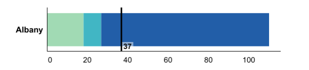
Color Switch in County Dial Based on Direction of Indicator Estimates
For Prevention Agenda tracking indicators where lower estimates are better (e.g., potentially preventable hospitalizations among adults, age-adjusted rate per 10,000),
the dark blue category is displayed on the right side of the dial.
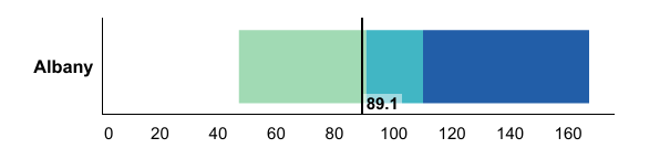
For Prevention Agenda tracking indicators where higher estimates are better (e.g., the percentage
of women with a preventive medical visit in the past year, aged 18-44 years), the dark blue category is displayed on the left side
of the dial.
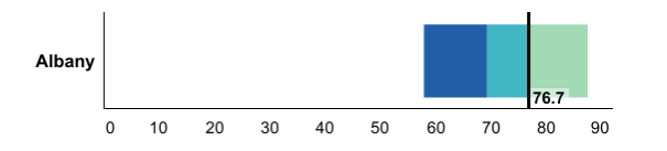
Comparing the Prevention Agenda Estimates with the Prevention Agenda Objectives
A green color in bar charts or for a number displayed in a data table indicates that the current value for
the Prevention Agenda tracking indicator met the Prevention Agenda 2024 Objective. A red color
in bar charts or for a number displayed in a data table indicates that the current value for the Prevention Agenda
tracking indicator did not meet the Prevention Agenda 2024 Objective.
Assessing the Indicator Performance
Three different methods were used to assess indicator performance.
- Conduct one-sided z-test to assess the change (increase/decrease or improve/worsen) in estimates between the two most
recent time periods. The p-value for rejecting the null hypothesis is less than or equal to 0.05 and the critical
value for the one-sided test (p-value at 0.05) is 1.645. 4
- A comparison of confidence intervals of estimates for the two most recent time periods was performed
where this method was more appropriate. 4 A confidence interval is a range around an estimate
that conveys how precise the estimate is. Differences between estimates are considered “statistically significant” when the estimates
being compared do not have overlapping confidence intervals. For the purposes of this dashboard, in cases where the confidence intervals
overlap, the difference is interpreted as not statistically significant at the 95% confidence level.
For survey related indicators, estimates and the two-sided 95% confidence intervals were obtained and used.
In some instances for count data (e.g., births, deaths, hospitalizations, and emergency department visits),
we calculated the one-sided 95% confidence intervals for the estimates and used them for comparison to evaluate
the indicator performance.5
NOTE: This method is an approximation of a statistical
test and may result in a more conservative finding. In some cases, an appropriate statistical test would indicate a statistically
significant difference even though the confidence intervals overlap and falsely imply no significant difference.
When two confidence intervals do not overlap, though, a comparable statistical test would always indicate a statistically
significant difference.6
- Simple comparison was conducted where the two estimates were directly compared to each other
based on their magnitude. This was performed when there was not a sufficient amount of data to conduct significance
testing; or if confidence intervals could not be calculated; or if there is some overlap of the two time intervals being
compared (e.g., 2014-2016 and 2015-2017 maternal mortality indicators).
The categories for the Indicator Performance
are as follows:
- Significantly improved
- Significantly worsened
- No significant change
- Improved^
- Worsened^
- No change^
- Baseline data
The "^" sign indicates that the performance was determined using simple comparison and not statistical tests.
The most recent data available during the planning phase were used as a baseline to set the Prevention Agenda 2024 Objective/Target.
“Indicator Performance” is not assessed if there are no available data points that are more recent than the baseline data.
Therefore, the “Indicator Performance” is labeled as "Baseline data" until updated data are available.
See Table 1 below for statistical significance techniques used for each type of data source to assess
the indicator performance.
Use caution when interpreting significance. For more common conditions (i.e., high incidence rates), there is a
higher likelihood that a relatively small change could be detected as statistically significant. Conversely,
for rare conditions, the likelihood of detecting a statistically significant change is low even for reasonable changes.
Data Filters
Several data filters are available on state and county views to quickly select indicators based on commonly desired criteria.
Multiple filters can be selected simultaneously.
- State data filters: two data filters are available for state level indicators
- Filter on meeting 2024 objective target: This filter displays indicators, where the most recent state level data meeting
or not meeting the Prevention Agenda 2024 objectives.
- Filter on indicator performance over time: The performance status for each indicator is generated by comparing state level data
for the two most recent time periods. This filter displays indicators based on indicator performance categories selected.
- County data filters: three data filters are available for county level indicators
- Filter on meeting 2024 objective target: This filter displays indicators, where the most recent specific county data meeting
or not meeting the Prevention Agenda 2024 objectives.
- Filter on indicator performance over time: The performance status for each indicator is generated by comparing estimates
for the two most recent time periods for a specific county. This filter displays indicators based on indicator performance categories selected.
- Filter on county’s position of concern level: This filter displays indicators based on how a county is doing in comparison to other counties in a quartile distribution.
Sub-county Data
To better serve the needs for more local level data, we have assessed the availability of sub-county level data
for the existing county level indicators. Depending on the availability of the information from the data sources,
sub-county level data are presented in one of the following three geographic levels: ZIP Code, school district,
or minor civil division (MCD)/community district (CD).
- ZIP Code: For indicators generated from SPARCS (inpatient and outpatient)
data, ZIP Code refers to resident address ZIP Code. If a ZIP Code crosses county borders, the ZIP Code
is assigned to the county which has the largest proportion of the population of that ZIP Code.
ZIP Code level population estimates used for calculating rates were obtained by the
New York State Department of Health (NYSDOH) from the Claritas Corporation.
- School District: Student weight data at the school district level
(outside of New York City) came from the Student Weight Status Category Reporting System (SWSCR).
A school district boundary file was generated by combining two US Census shape files – a unified school district file and
a secondary school district file.
- Minor Civil Division (MCD)/Community District (CD): Birth and death
certificate data for counties outside of New York City (NYC) are presented by MCD. Data for NYC boroughs
are presented by CD. There are 59 CDs within the five NYC boroughs.
Note: A small
percent of records did not have an assigned MCD or CD, but the records had other geographic identifiers.
For NYC records with missing CD, ZIP Code information was used to look up and assign the CD location
utilizing NYC Department of Planning geographic data linking ZIP Codes to CDs. This linked file contains
a small number of ZIP Codes, which were completely contained within a single CD. Records with those ZIP
codes were assigned to those CDs. For records of residents from the rest of the state (ROS),
outside of NYC, with a missing MCD, the New York State Gazetteer code* was used to look up the MCD code.
DOH staff linked the Gazetteer codes to MCDs, and the linkage was used to assign records outside of
NYC to an MCD.
*The New York State Gazetteer was prepared by the New York State Department of Health
(see:
health.data.ny.gov/Health/New-York-State-Gazetteer/cpcx-4uew)
Based on further assessment of the stability of the estimates and the impact of data suppression,
the following six indicators were selected for incorporating into the current PA tracking dashboard.
- ZIP Code level:
- Potentially preventable hospitalizations among adults, age-adjusted rate per 10,000
- Asthma emergency department visits, rate per 10,000, aged 0-17 years
- School district level:
- Percentage of children and adolescents with obesity (NYS excluding NYC)
- MCD/CD level:
- Percentage of premature deaths (before age 65 years)
- Percentage of births that are preterm
- Percentage of infants who are exclusively breastfed in the hospital among all infants
Data Suppression for Confidentiality
Results are not shown (i.e., suppressed) when issues of confidentiality exist. Suppression rules vary depending
on the data source and the indicator.
Table 1. Summary of data suppression and statistical evaluation significance for the Prevention Agenda Indicators
by data source
Data Sources
Suppression Criteria
Statistical Significance Techniques
Sample Surveys
Pregnancy Risk Assessment Monitoring System
Denominator <30
95% CI comparison
BRFSS and Expanded BRFSS
Numerator <6 or Denominator <50
95% CI comparison
US Census
90% CI comparison
National Survey on Drug Use and Health
95% CI comparison
Youth Risk Behavior Surveillance System
Denominator <100
95% CI comparison
Youth Tobacco Survey
95% CI comparison
Population Count Data
Death
Single Year: Denominator population <50;
Three-Year Combined: Denominator population <30
Rate/percentage: one sided chi-square test with p-value <0.05
Rate difference: one sided 95% CI comparison
Birth
Single Year: Denominator total Births <50
One sided chi-square test with p-value <0.05
Sexually Transmitted Infection (STI) Surveillance
One sided chi-square test with p-value <0.05
HIV Surveillance
Numerator 1-2 cases
County level (rate): one sided 95% CI comparison;
State level (rate): one sided chi-square test with p-value <0.05
SPARCS
Numerator between 1 - 5 cases
Rate/percentage: one sided chi-square test with p-value <0.05;
Ratio/Rate difference: one sided 95% CI comparison
Prescription Monitoring Program (PMP) Registry
Numerator between 1 - 5 cases
One sided chi-square test with p-value <0.05
CI: Confidence Interval
BRFSS: Behavioral Risk Factor Surveillance System
SPARCS: Statewide Planning and Research Cooperative System
Data Limitations
Table 2. Summary of Limitations for Data Presented on the Prevention Agenda Dashboard
Indicator
Data Source
Limitations
Sample Surveys
6 - Percentage of children and adolescents with obesity (NYS excluding NYC)
Student Weight Status Category Reporting System (SWSCRS)
Because of restrictions in reporting due to the Family Educational Rights and Privacy Act (FERPA), parents'/guardians' ability to
request that their child's weight status data be excluded from reporting, and other sources of missing data, not all students
have data in the data system. The percent of students with reported data varies from county to county. Therefore these estimates
do not necessarily represent all school aged-children attending school in that county. School districts report weight status data
separately for students in elementary school, middle/high school, and the school district as a whole, so that the counts of students
represented in the district totals for a county will not necessarily equal the counts of students in the elementary and middle/high
totals for that county.
Population Count Data
2 - Potentially preventable hospitalizations among adults, age-adjusted rate per 10,000
SPARCS
At the ZIP Code level, very unusual distributions in population denominator and/or numerator
(possibly due to multiple hospitalizations per individual) may result in extreme age adjusted rates,
therefore, these estimates are suppressed or to be interpreted with caution.
78 - Newly diagnosed HIV cases, rate per 100,000 population
HIV Surveillance
The discrepancy in totals is due to the exclusion of prisoner cases for counties outside NYC, but not for NYC
OR for the NYS total.
Note: The 2018 population estimates are also used to calculate rates for 2019 and 2020.
Revisions
References
- Klein RJ, Schoenborn CA. Age adjustment using the 2000 projected U.S. population. Healthy People
Statistical Notes, no. 20. Hyattsville, Maryland: National Center for Health Statistics. January 2001.
(see: www.cdc.gov/nchs/data/statnt/statnt20.pdf)
- About Age Adjusted Rates, 95% Confidence Intervals and Unstable Rates
(see: www.health.ny.gov/statistics/cancer/registry/age.htm)
- Klein RJ, Proctor SE, Boudreault MA, Turczyn KM. Healthy People 2010 criteria for data suppression.
Statistical Notes, no 24. Hyattsville, Maryland: National Center for Health Statistics. June 2002.
(see: www.cdc.gov/nchs/data/statnt/statnt24.pdf)
- Statistical Significance (see:
www.health.ny.gov/statistics/chac/chai/docs/statistical_significance.pdf)
- One-sided 95% confidence interval
(see:
http://www.graphpad.com/guides/prism/6/statistics/index.htm?one_sided_confidence_intervals.htm)
- Guidelines for using confidence intervals for public health assessment, Washington State
Department of Health, (see:
www.doh.wa.gov/Portals/1/Documents/1500/ConfIntGuide.pdf)
| Improve Health Status and Reduce Health Disparities | ||||
|---|---|---|---|---|
| Indicator | Indicator Description and Note | Data Source | Program and Data Contact | Prevention Agenda Priority Area |
| 1 - Percentage of deaths that are premature (before age 65 years) County Dashboard Tracking Indicator Number - 1 |
Percentage of deaths that occur before age 65 years | Vital Recordsa | Program Contact: Public Health Information Group phiginfo@health.ny.gov Data Contact: Vital Statistics Unit Bureau of Health Informatics Division of Information and Statistics Office of Quality and Patient Safety Contact: bio-info@health.ny.gov Phone: (518) 473-8144 |
Improve Health Status and Reduce Health Disparities |
| 1.1 - Premature deaths (before age 65 years), difference in percentages between Black non-Hispanics and White non-Hispanics County Dashboard Tracking Indicator Number - 1.1 |
The percentage of premature deaths before age 65 is calculated for both Blacks and White non-Hispanics. Then, the difference is the Black non-Hispanic rate minus the White non-Hispanic rate. | Vital Recordsa | Program Contact: Public Health Information Group phiginfo@health.ny.gov Data Contact: Vital Statistics Unit Bureau of Health Informatics Division of Information and Statistics Office of Quality and Patient Safety Contact: bio-info@health.ny.gov Phone: (518) 473-8144 |
Improve Health Status and Reduce Health Disparities |
| 1.2 - Premature deaths (before age 65 years), difference in percentages between Hispanics and White non-Hispanics County Dashboard Tracking Indicator Number - 1.2 |
The percentage of premature deaths before age 65 is calculated for Hispanics and White non-Hispanics. Then the difference is the Hispanic rate minus the White non-Hispanic rate. | Vital Recordsa | Program Contact: Public Health Information Group phiginfo@health.ny.gov Data Contact: Vital Statistics Unit Bureau of Health Informatics Division of Information and Statistics Office of Quality and Patient Safety Contact: bio-info@health.ny.gov Phone: (518) 473-8144 |
Improve Health Status and Reduce Health Disparities |
| 2 - Potentially preventable hospitalizations among adults, age-adjusted rate per 10,000 County Dashboard Tracking Indicator Number - 2 |
The number of potentially preventable hospitalizations per 10,000 population aged 18+ years. The Prevention Quality Indicators (PQIs) are a set of measures developed by the federal Agency for Healthcare Research and Quality (AHRQ) for use in assessing the quality of outpatient care for "ambulatory care sensitive conditions" (ACSCs). This indicator is defined as the combination of the 10 PQIs that pertain to adults: (1) Short-term Complication of Diabetes (2) Long-term Complication of Diabetes (3) Chronic Obstructive Pulmonary Disease (COPD) or Asthma in Older Adults (4) Hypertension (5) Heart Failure (6) Community-Acquired Pneumonia (7) Urinary Tract Infection (8) Uncontrolled Diabetes (9) Asthma in Younger Adults (10) Lower-Extremity Amputation Among Patients with Diabetes. Because the PQIs estimate the number of potentially avoidable hospital admissions, a lower rate is desirable. The rate is adjusted for age. | Statewide Planning and Research Cooperative System (SPARCS)b | Program Contact: Public Health Information Group phiginfo@health.ny.gov Data Contact: Bureau of Health Informatics Division of Information and Statistics Office of Quality and Patient Safety Contact: sparcs.requests@health.ny.gov Phone: (518) 473-8144 |
Improve Health Status and Reduce Health Disparities |
| 2.1 - Potentially preventable hospitalizations among adults, difference in age-adjusted rates per 10,000 between Black non-Hispanics and White non-Hispanics County Dashboard Tracking Indicator Number - 2.1 |
The rate of potentially preventable hospitalization is calculated for both Black and White non-Hispanics. Then, the difference is the Black non-Hispanic rate minus the White non-Hispanic rate. Both rates are adjusted for age. | Statewide Planning and Research Cooperative System (SPARCS)b | Program Contact: Public Health Information Group phiginfo@health.ny.gov Data Contact: Bureau of Health Informatics Division of Information and Statistics Office of Quality and Patient Safety Contact: sparcs.requests@health.ny.gov Phone: (518) 473-8144 |
Improve Health Status and Reduce Health Disparities |
| 2.2 - Potentially preventable hospitalizations among adults, difference in age-adjusted rates per 10,000 between Hispanics and White non-Hispanics County Dashboard Tracking Indicator Number - 2.2 |
The rate of potentially preventable hospitalization is calculated for both Hispanics and White non-Hispanics. Then, the difference is the Hispanic rate minus the White non-Hispanic rate. Both rates are adjusted for age. | Statewide Planning and Research Cooperative System (SPARCS)b | Program Contact: Public Health Information Group phiginfo@health.ny.gov Data Contact: Bureau of Health Informatics Division of Information and Statistics Office of Quality and Patient Safety Contact: sparcs.requests@health.ny.gov Phone: (518) 473-8144 |
Improve Health Status and Reduce Health Disparities |
| 3 - Percentage of adults with health insurance, aged 18-64 years County Dashboard Tracking Indicator Number - 3 |
The percentage of adults (aged 18-64 years) who reported that they had health insurance coverage | U.S. Census Bureau - Small Area Health Insurance Estimates (SAHIE), https://www.census.gov/data-tools/demo/sahie/#/ | Program Contact: Public Health Information Group phiginfo@health.ny.gov |
Improve Health Status and Reduce Health Disparities |
| 4 - Adults who have a regular health care provider, age-adjusted percentage County Dashboard Tracking Indicator Number - 4 |
Age-adjusted percentage of adults (aged 18 years and older) who reported that they had a regular health care provider | NYS Behavioral Risk Factor Surveillance Systemc | Program Contact: Bureau of Community Chronic Disease Prevention ManageYourHealthNY@health.ny.gov Data Contact: BRFSS Program BRFSS@health.ny.gov |
Improve Health Status and Reduce Health Disparities |
| Prevent Chronic Diseases | ||||
| Indicator | Indicator Description and Note | Data Source | Program and Data Contact | Prevention Agenda Priority Area |
| 5 - Percentage of children with obesity, among children aged 2-4 years participating in the WIC program County Dashboard Tracking Indicator Number - 5 |
Percentage of children with obesity among children ages 2-4 years participating in the Special Supplemental Nutrition Program for Women, Infants, and Children (WIC) | NYS Pediatric Nutrition Surveillance System | Program Contact: Division of Nutrition WICDATA@health.ny.gov |
Healthy Eating and Food Security |
| 6 - Percentage of children and adolescents with obesity County Dashboard Tracking Indicator Number - 6 |
The percentage of public school children with obesity. Obesity is defined as weight category greater than or equal to 95th percentile. Counties outside NYC: Grades pre-K, K, 2nd, 4th, 7th, and 10th prior to the 2019-2020 school year; grades pre-K, K, 1st, 3rd, 5th, 7th, 9th, and 11th starting with the 2019-2020 school year; data collected over two school years. NYC boroughs: Grades K-8th, data collected over one school year. Due to changes in SWSCR data collection during the 2019-2020 school year, estimates from the 2019-2021 school years may not be directly comparable to previous school years. | Student Weight Status Category Reporting System (SWSCRS) | Program Contact: Bureau of Community Chronic Disease Prevention ManageYourHealthNY@health.ny.gov Data Contact: Student Weight Status Category Reporting schoolbmi@health.ny.gov |
Healthy Eating and Food Security |
| 7 - Percentage of children and adolescents with obesity County Dashboard Tracking Indicator Number - 6 |
The percentage of public school children with obesity. Obesity is defined as weight category greater than or equal to 95th percentile. Counties outside NYC: Grades pre-K, K, 2nd, 4th, 7th, and 10th prior to the 2019-2020 school year; grades pre-K, K, 1st, 3rd, 5th, 7th, 9th, and 11th starting with the 2019-2020 school year; data collected over two school years. NYC boroughs: Grades K-8th, data collected over one school year. | NYC Fitnessgram | Program Contact: Bureau of Community Chronic Disease Prevention ManageYourHealthNY@health.ny.gov |
Healthy Eating and Food Security |
| 8 - Percentage of adults with obesity County Dashboard Tracking Indicator Number - 7 |
The percentage of adults (aged 18 years and older) with obesity. Obesity is defined as having a body mass index (BMI) of 30.0 or greater. BMI is calculated as weight in kilograms divided by the square of height in meters (w/h2). | NYS Behavioral Risk Factor Surveillance Systemc | Program Contact: Bureau of Community Chronic Disease Prevention ManageYourHealthNY@health.ny.gov Data Contact: BRFSS Program BRFSS@health.ny.gov |
Healthy Eating and Food Security |
| 8.1 - Percentage of adults with an annual household income less than $25,000 with obesity County Dashboard Tracking Indicator Number - 7.1 |
The percentage of adults (aged 18 years and older) with an annual household income less than $25,000 with obesity | NYS Behavioral Risk Factor Surveillance Systemc | Program Contact: Bureau of Community Chronic Disease Prevention ManageYourHealthNY@health.ny.gov Data Contact: BRFSS Program BRFSS@health.ny.gov |
Healthy Eating and Food Security |
| 9 - Percentage of adults with an annual household income less than $25,000 who consume one or more sugary drinks per day County Dashboard Tracking Indicator Number - 8 |
The percentage of adults (aged 18 years and older) with an annual household income less than $25,000 who consume one or more sugary drinks per day | NYS Behavioral Risk Factor Surveillance Systemc | Program Contact: Bureau of Community Chronic Disease Prevention ManageYourHealthNY@health.ny.gov Data Contact: BRFSS Program BRFSS@health.ny.gov |
Healthy Eating and Food Security |
| 10 - Percentage of adults with an annual household income less than $25,000 with perceived food security County Dashboard Tracking Indicator Number - 9 |
The percentage of adults (aged 18 years and older) with perceived food security with an annual household income less than $25,000 | NYS Behavioral Risk Factor Surveillance Systemc | Program Contact: Bureau of Community Chronic Disease Prevention ManageYourHealthNY@health.ny.gov Data Contact: BRFSS Program BRFSS@health.ny.gov |
Healthy Eating and Food Security |
| 11 - Percentage of adults who participate in leisure-time physical activity County Dashboard Tracking Indicator Number - 10 |
The percentage of adults (aged 18 years and older) who participate in leisure-time physical activity | NYS Behavioral Risk Factor Surveillance Systemc | Program Contact: Bureau of Community Chronic Disease Prevention ManageYourHealthNY@health.ny.gov Data Contact: BRFSS Program BRFSS@health.ny.gov |
Physical Activity |
| 11.1 - Percentage of adults with disabilities who participate in leisure-time physical activity County Dashboard Tracking Indicator Number - 10.1 |
The percentage of adults (aged 18 years and older) with disabilities who participate in leisure-time physical activity | NYS Behavioral Risk Factor Surveillance Systemc | Program Contact: Bureau of Community Chronic Disease Prevention ManageYourHealthNY@health.ny.gov Data Contact: BRFSS Program BRFSS@health.ny.gov |
Physical Activity |
| 11.2 - Percentage of adults who participate in leisure-time physical activity - aged 65+ years County Dashboard Tracking Indicator Number - 10.2 |
The percentage of adults (aged 65 years and older) who participate in leisure-time physical activity | NYS Behavioral Risk Factor Surveillance Systemc | Program Contact: Bureau of Community Chronic Disease Prevention ManageYourHealthNY@health.ny.gov Data Contact: BRFSS Program BRFSS@health.ny.gov |
Physical Activity |
| 12 - Percentage of high school students who are physically active |
The percentage of high school students (grades 9-12) who are physically active for a total of at least 60 minutes/day on all 7 days | Youth Risk Behavior Surveillance System | Program Contact: Bureau of Community Chronic Disease Prevention ManageYourHealthNY@health.ny.gov Data Contact: Bureau of Chronic Disease Evaluation and Research bcder@health.ny.gov |
Physical Activity |
| 13 - Prevalence of combustible cigarette use by high school age students |
The prevalence of combustible cigarette use by high school age students | NYS Youth Tobacco Survey | Program Contact: Bureau of Tobacco Control tcp@health.ny.gov Data Contact: Bureau of Chronic Disease Evaluation and Research bcder@health.ny.gov |
Tobacco Prevention |
| 14 - Prevalence of vaping product use by high school age students |
The prevalence of vaping product use by high school age students | NYS Youth Tobacco Survey | Program Contact: Bureau of Tobacco Control tcp@health.ny.gov Data Contact: Bureau of Chronic Disease Evaluation and Research bcder@health.ny.gov |
Tobacco Prevention |
| 15 - Prevalence of cigarette smoking among adults County Dashboard Tracking Indicator Number - 11 |
The prevalence of adults (aged 18 years and older) who report currently smoking cigarettes | NYS Behavioral Risk Factor Surveillance Systemc | Program Contact: Bureau of Tobacco Control tcp@health.ny.gov Data Contact: BRFSS Program BRFSS@health.ny.gov |
Tobacco Prevention |
| 15.1 - Percentage of adults who smoke cigarettes among adults with income less than $25,000 County Dashboard Tracking Indicator Number - 11.1 |
The percentage of adults (aged 18 years and older) with an annual household income less than $25,000 who report currently smoking cigarettes | NYS Behavioral Risk Factor Surveillance Systemc | Program Contact: Bureau of Tobacco Control tcp@health.ny.gov Data Contact: BRFSS Program BRFSS@health.ny.gov |
Tobacco Prevention |
| 16 - Utilization of smoking cessation benefits among smokers who are enrolled in Medicaid |
The percentage of smokers enrolled in Medicaid who utilized smoking cessation benefits | NYSDOH Office of Quality and Patient Safety, Medicaid Program | Program Contact: Bureau of Tobacco Control tcp@health.ny.gov |
Tobacco Prevention |
| 17 - Percentage of non-smoking adults, living in multi-unit housing, who were exposed to secondhand smoke in their homes |
The percentage of adults (non-smoking, aged 18 years and older) living in multi-unit housing who were exposed to secondhand smoke in their homes | NYS Adult Tobacco Survey | Program Contact: Bureau of Tobacco Control tcp@health.ny.gov Data Contact: Bureau of Chronic Disease Evaluation and Research bcder@health.ny.gov |
Tobacco Prevention |
| 18 - Percentage of adults with an annual household income less than $25,000 who receive a colorectal cancer screening based on the most recent guidelines, aged 50-75 years |
The percentage of adults (aged 50-75 years) with an annual household income less than $25,000 who receive a colorectal cancer screening based on the most recent guidelines | NYS Behavioral Risk Factor Surveillance Systemc | Program Contact: Cancer Services Program canserv@health.ny.gov Data Contact: Bureau of Chronic Disease Evaluation and Research bcder@health.ny.gov |
Chronic Disease Preventive Care and Management |
| 19 - Percentage of adults who receive a colorectal cancer screening based on the most recent guidelines, aged 50-64 years County Dashboard Tracking Indicator Number - 12 |
The percentage of adults (aged 50-64 years) who receive a colorectal cancer screening based on the most recent guidelines | NYS Behavioral Risk Factor Surveillance Systemc | Program Contact: Cancer Services Program canserv@health.ny.gov Data Contact: Bureau of Chronic Disease Evaluation and Research bcder@health.ny.gov |
Chronic Disease Preventive Care and Management |
| 20 - Percentage of adults who had a test for high blood sugar or diabetes within the past three years, aged 45+ years County Dashboard Tracking Indicator Number - 13 |
The percentage of adults (aged 45 years and older) who had a test for high blood sugar or diabetes within the past three years | NYS Behavioral Risk Factor Surveillance Systemc | Program Contact: Bureau of Community Chronic Disease Prevention ManageYourHealthNY@health.ny.gov Data Contact: Bureau of Chronic Disease Evaluation and Research bcder@health.ny.gov |
Chronic Disease Preventive Care and Management |
| 20.1 - Percentage of adults with an annual household income less than $25,000 who had a test for high blood sugar or diabetes within the past three years, aged 45+ years County Dashboard Tracking Indicator Number - 13.1 |
The percentage of adults (aged 45 years and older) with an annual household income less than $25,000 who had a test for high blood sugar or diabetes within the past three years | NYS Behavioral Risk Factor Surveillance Systemc | Program Contact: Bureau of Community Chronic Disease Prevention ManageYourHealthNY@health.ny.gov Data Contact: Bureau of Chronic Disease Evaluation and Research bcder@health.ny.gov |
Chronic Disease Preventive Care and Management |
| 21 - Asthma emergency department visits, rate per 10,000, aged 0-17 years County Dashboard Tracking Indicator Number - 14 |
The number of emergency department visits with primary diagnosis of asthma per 10,000 population - aged 0-17 years | Statewide Planning and Research Cooperative System (SPARCS)b | Program Contact: Asthma Surveillance Program phiginfo@health.ny.gov Data Contact: Bureau of Health Informatics Division of Information and Statistics Office of Quality and Patient Safety Contact: sparcs.requests@health.ny.gov Phone: (518) 473-8144 |
Chronic Disease Preventive Care and Management |
| 22 - Percentage of Medicaid Managed Care members who were identified as having persistent asthma and had a ratio of controller medications to total asthma medications of 0.50 or greater during the measurement year, aged 5-18 years County Dashboard Tracking Indicator Number - 15 |
The percentage of Medicaid Managed Care members (aged 5-18 years) who were identified as having persistent asthma and had a ratio of controller medications to total asthma medications of 0.50 or greater during the measurement year. To be identified as having persistent asthma, individuals must have had a 3M Episode Diagnostic Category (EDC) of 138, 145 in the calendar year and year prior, and aged 5 to 18 years who were continuously enrolled in a Mainstream, HARP, or SNP MMC health plan for 24 or more months, as of the most recent reporting year. Note: NCQA HEDIS measure, the percentage of Medicaid Managed Care members (aged 5-18 years) who were identified as having persistent asthma and were dispensed appropriate asthma controller medications for at least 50% of the treatment period, retired in 2020. | Office of Quality and Patient Safety, QARR Report | Program Contact: Asthma Surveillance Program phiginfo@health.ny.gov Data Contact: Office of Quality and Patient Safety nysqarr@health.ny.gov |
Chronic Disease Preventive Care and Management |
| 23 - Percentage of adults with hypertension who are currently taking medicine to manage their high blood pressure County Dashboard Tracking Indicator Number - 16 |
The percentage of adults (aged 18 years and older) with hypertension who are currently taking medicine to manage their high blood pressure | NYS Behavioral Risk Factor Surveillance Systemc | Program Contact: Bureau of Community Chronic Disease Prevention ManageYourHealthNY@health.ny.gov Data Contact: Bureau of Chronic Disease Evaluation and Research bcder@health.ny.gov |
Chronic Disease Preventive Care and Management |
| 24 - Percentage of adults with chronic conditions (arthritis, asthma, CVD, diabetes, CKD, cancer) who have taken a course or class to learn how to manage their condition County Dashboard Tracking Indicator Number - 17 |
The percentage of adults (aged 18 years and older) with chronic conditions (arthritis, asthma, cardiovascular disease (CVD), diabetes, chronic kidney disease (CKD), cancer) who have taken a course or class to learn how to manage their condition | NYS Behavioral Risk Factor Surveillance Systemc | Program Contact: Arthritis Program EBSMP@health.ny.gov Data Contact: Bureau of Chronic Disease Evaluation and Research bcder@health.ny.gov |
Chronic Disease Preventive Care and Management |
| Promote a Healthy and Safe Environment | ||||
| Indicator | Indicator Description and Note | Data Source | Program and Data Contact | Prevention Agenda Priority Area |
| 25 - Hospitalizations due to falls among adults, rate per 10,000 population, aged 65+ years County Dashboard Tracking Indicator Number - 18 |
The number of hospitalizations (inpatient, aged 65 years and older) per 10,000 population aged 65 and older. | Statewide Planning and Research Cooperative System (SPARCS)b | Program Contact: Bureau of Occupational Health and Injury Prevention boh@health.ny.gov Data Contact: Bureau of Health Informatics Division of Information and Statistics Office of Quality and Patient Safety Contact: sparcs.requests@health.ny.gov Phone: (518) 473-8144 |
Injuries, Violence and Occupational Health |
| 26 - Assault-related hospitalizations, rate per 10,000 population County Dashboard Tracking Indicator Number - 19 |
The number of assault-related hospitalizations per 10,000 population. As of October 1, 2015, medical data coded using the International Classification of Diseases, 10th Revision, Clinic Modification (ICD-10-CM) requires coders to assign unintentional intent when the intent is not stated in the medical record. This may lead to an overcount of unintentional injuries and an undercount of intentional injuries, such as assaults and self-harm. | Statewide Planning and Research Cooperative System (SPARCS)b | Program Contact: Bureau of Occupational Health and Injury Prevention boh@health.ny.gov Data Contact: Bureau of Health Informatics Division of Information and Statistics Office of Quality and Patient Safety Contact: sparcs.requests@health.ny.gov Phone: (518) 473-8144 |
Injuries, Violence and Occupational Health |
| 26.1 - Assault-related hospitalizations, ratio of rates between Black non-Hispanics and White non-Hispanics County Dashboard Tracking Indicator Number - 19.1 |
The ratio of the rates of assault-related hospitalization for Black non-Hispanics compared to White non-Hispanics. As of October 1, 2015, medical data coded using the International Classification of Diseases, 10th Revision, Clinic Modification (ICD-10-CM) requires coders to assign unintentional intent when the intent is not stated in the medical record. This may lead to an overcount of unintentional injuries and an undercount of intentional injuries, such as assaults and self-harm. | Statewide Planning and Research Cooperative System (SPARCS)b | Program Contact: Bureau of Occupational Health and Injury Prevention boh@health.ny.gov Data Contact: Bureau of Health Informatics Division of Information and Statistics Office of Quality and Patient Safety Contact: sparcs.requests@health.ny.gov Phone: (518) 473-8144 |
Injuries, Violence and Occupational Health |
| 26.2 - Assault-related hospitalizations, ratio of rates between Hispanics and White non-Hispanics County Dashboard Tracking Indicator Number - 19.2 |
The ratio of the rates of assault-related hospitalization for Hispanics compared to White non-Hispanics. As of October 1, 2015, medical data coded using the International Classification of Diseases, 10th Revision, Clinic Modification (ICD-10-CM) requires coders to assign unintentional intent when the intent is not stated in the medical record. This may lead to an overcount of unintentional injuries and an undercount of intentional injuries, such as assaults and self-harm. | Statewide Planning and Research Cooperative System (SPARCS)b | Program Contact: Bureau of Occupational Health and Injury Prevention boh@health.ny.gov Data Contact: Bureau of Health Informatics Division of Information and Statistics Office of Quality and Patient Safety Contact: sparcs.requests@health.ny.gov Phone: (518) 473-8144 |
Injuries, Violence and Occupational Health |
| 26.3 - Assault-related hospitalizations, ratio of rates between low-income ZIP Codes and non-low-income ZIP Codes County Dashboard Tracking Indicator Number - 19.3 |
The ratio of the rates of assault-related hospitalization in low-income ZIP Codes compared to non-low-income ZIP Codes. As of October 1, 2015, medical data coded using the International Classification of Diseases, 10th Revision, Clinic Modification (ICD-10-CM) requires coders to assign unintentional intent when the intent is not stated in the medical record. This may lead to an overcount of unintentional injuries and an undercount of intentional injuries, such as assaults and self-harm. | Statewide Planning and Research Cooperative System (SPARCS)b | Program Contact: Bureau of Occupational Health and Injury Prevention boh@health.ny.gov Data Contact: Bureau of Health Informatics Division of Information and Statistics Office of Quality and Patient Safety Contact: sparcs.requests@health.ny.gov Phone: (518) 473-8144 |
Injuries, Violence and Occupational Health |
| 27 - Firearm assault-related hospitalizations, rate per 10,000 population County Dashboard Tracking Indicator Number - 20 |
Firearm assault-related hospitalization rate per 10,000 people. As of October 1, 2015, medical data coded using the International Classification of Diseases, 10th Revision, Clinic Modification (ICD-10-CM) requires coders to assign unintentional intent when the intent is not stated in the medical record. This may lead to an overcount of unintentional injuries and an undercount of intentional injuries, such as assaults and self-harm. | Statewide Planning and Research Cooperative System (SPARCS)b | Program Contact: Bureau of Occupational Health and Injury Prevention boh@health.ny.gov Data Contact: Bureau of Health Informatics Division of Information and Statistics Office of Quality and Patient Safety Contact: sparcs.requests@health.ny.gov Phone: (518) 473-8144 |
Injuries, Violence and Occupational Health |
| 28 - Work-related emergency department (ED) visits, ratio of rates between Black non-Hispanics and White non-Hispanics County Dashboard Tracking Indicator Number - 21 |
The ratio of rates for work-related emergency department visits between Black non-Hispanics and White non-Hispanics | Statewide Planning and Research Cooperative System (SPARCS)b | Program Contact: Bureau of Occupational Health and Injury Prevention boh@health.ny.gov Data Contact: Bureau of Health Informatics Division of Information and Statistics Office of Quality and Patient Safety Contact: sparcs.requests@health.ny.gov Phone: (518) 473-8144 |
Injuries, Violence and Occupational Health |
| 29 - Crash-related pedestrian fatalities, rate per 100,000 population County Dashboard Tracking Indicator Number - 22 |
Crash-related pedestrian fatalities, rate per 100,000 population | Vital Recordsa | Program Contact: Bureau of Occupational Health and Injury Prevention boh@health.ny.gov Data Contact: Bureau of Production Systems Management Vital Records Contact: vr@health.ny.gov |
Injuries, Violence and Occupational Health |
| 30 - Annual number of days with air quality index >100 (unhealthy levels of ozone or particulate matter) |
Number of days each year when the air quality index is >100 (unhealthy levels of ozone or particulate matter) in at least one air quality region of the State | Department of Environmental Conservation | Program Contact: Bureau of Toxic Substance Assessment btsa@health.ny.gov |
Outdoor Air Quality |
| 31 - Percentage of population living in a certified Climate Smart Community County Dashboard Tracking Indicator Number - 23 |
Percentage of population living in a certified Climate Smart Community | Department of Environmental Conservation, Climate Smart Communities program | Program Contact: Environmental Public Health Tracking Program epht@health.ny.gov |
Built and Indoor Environments |
| 32 - Percentage of people who commute to work using alternate modes of transportation (e.g., public transportation, carpool, bike/walk) or who telecommute County Dashboard Tracking Indicator Number - 24 |
Proportion of people who commute to work using alternate modes of transportation (e.g., public transportation, carpool, bike/walk) or who telecommute | U.S. Census Bureau, American Community Survey | Program Contact: Environmental Public Health Tracking Program epht@health.ny.gov |
Built and Indoor Environments |
| 33 - Percentage of registered cooling towers in compliance with 10 NYCRR Subpart 4-1 County Dashboard Tracking Indicator Number - 25 |
Percent of cooling towers registered with the NYSDOH that are in compliance (excluding towers in NYC) | NYS Cooling Tower Registry | Program Contact: Bureau of Water Supply Protection Contact: cooling.tower@health.ny.gov Phone: (518) 402-7650 |
Built and Indoor Environments |
| 34 - Number of homes inspected for lead and other health hazards |
Annual number of residential housing units inspected for the Lead Poisoning Prevention Program, Childhood Lead Poisoning Primary Prevention Program, and the Healthy Neighborhoods Program | NYSDOH Childhood Lead Poisoning Prevention Program Reports and other programs | Program Contact: Bureau of Community Environmental Health and Food Protection Contact: lppp@health.ny.gov Phone: (518) 402-7600 |
Built and Indoor Environments |
| 35 - Number of radon tests performed per year, three-year average |
Number of radon tests performed, including testing of homes, schools, daycares, and some government buildings | NYSDOH Radon Database/Application and Dataset per 10 NYCRR Part 16.130(b)(1) | Program Contact: Bureau of Environmental Radiation Protection NYS Radon Program Contact: radon@health.ny.gov Phone: (518) 402-7556 |
Built and Indoor Environments |
| 36 - Number of homes mitigated per year for radon, three-year average |
Number of homes where mitigation systems to address radon were installed | Dataset per 10 NYCRR Part 16.130(b)(3) | Program Contact: Bureau of Environmental Radiation Protection NYS Radon Program Contact: radon@health.ny.gov Phone: (518) 402-7556 |
Built and Indoor Environments |
| 37 - Number of public water systems per year that were awarded infrastructure improvement assistance, three-year average |
The number of public water systems awarded funding for infrastructure improvements through Drinking Water State Revolving Fund (DWSRF) and Water Infrastructure Improvement Act (WIIA)/Intermunicipal Water Infrastructure Grants (IMG). These are voluntary programs, communities choose to apply for funding. | DWSRF, WIIA/IMG Program | Program Contact: Michael Montysko, P.E., Design Section Chief Bureau of Water Supply Protection Contact: bwsp@health.ny.gov Phone: (518) 402-7650 |
Water Quality |
| 38 - Number of counties with mapped waterbodies detailing contamination |
Cumulative number of maps available at the county-level. The county-level maps illustrate public access waters and the applicable NYSDOH fish advisory for those waters. The maps highlight many waters where everyone in the family can eat up to four fish meals per month. | Fish Advisory Maps by County | Program Contact: Center for Environmental Health Outreach and Education Contact: HRFA@health.ny.gov Phone: (518) 402-7530 |
Water Quality |
| 39 - Percentage of foodborne outbreaks where contributing factors were identified |
The annual percentage of foodborne outbreaks where the contributing factor(s) is/are identified. Contributing factors are the root causes of foodborne disease outbreaks. | NYS Foodborne Disease Surveillance | Program Contact: Bureau of Community Environmental Health and Food Protection Contact: bcehfp@health.ny.gov Phone: (518) 402-7600 |
Food and Consumer Products |
| Promote Healthy Women, Infants, and Children | ||||
| Indicator | Indicator Description and Note | Data Source | Program and Data Contact | Prevention Agenda Priority Area |
| 40 - Percentage of women with a preventive medical visit in the past year, aged 18-44 years County Dashboard Tracking Indicator Number - 26 |
The number of women, aged 18 through 44 years, who had a routine preventive medical visit in the past year per 100 women aged 18 through 44 years | NYS Behavioral Risk Factor Surveillance Systemc | Program Contact: Bureau of Community Chronic Disease Prevention ManageYourHealthNY@health.ny.gov Data Contact: BRFSS Program BRFSS@health.ny.gov |
Maternal & Women's Health |
| 41 - Percentage of women with a preventive medical visit in the past year, aged 45+ years County Dashboard Tracking Indicator Number - 27 |
The number of women, aged 45 years and older, who had a routine preventive medical visit in the past year per 100 women aged 45 years and older | NYS Behavioral Risk Factor Surveillance Systemc | Program Contact: Bureau of Community Chronic Disease Prevention ManageYourHealthNY@health.ny.gov Data Contact: BRFSS Program BRFSS@health.ny.gov |
Maternal & Women's Health |
| 42 - Percentage of women who report ever talking with a health care provider about ways to prepare for a healthy pregnancy, aged 18-44 years County Dashboard Tracking Indicator Number - 28 |
The number of women, aged 18 through 44 years, who talked with a health care provider about ways to prepare for a healthy pregnancy per 100 women aged 18 through 44 years | NYS Behavioral Risk Factor Surveillance Systemc | Program Contact: Bureau of Community Chronic Disease Prevention ManageYourHealthNY@health.ny.gov Data Contact: BRFSS Program BRFSS@health.ny.gov |
Maternal & Women's Health |
| 43 - Maternal mortality, rate per 100,000 live births County Dashboard Tracking Indicator Number - 29 |
The number of deaths related to or aggravated by pregnancy and occurring within 42 days of the end of pregnancy (defined as death records with causes of death ICD-10: A34, O00-O95, and O98-O99) per 100,000 live births | Vital Recordsa | Program Contact: Public Health Information Group phiginfo@health.ny.gov Data Contact: Vital Statistics Unit Bureau of Health Informatics Division of Information and Statistics Office of Quality and Patient Safety Contact: bio-info@health.ny.gov Phone: (518) 473-8144 |
Maternal & Women's Health |
| 43.1 - Maternal mortality, ratio of rates between Black non-Hispanics and White non-Hispanics |
The rate of maternal deaths due to pregnancy is calculated for Black non-Hispanics and White non-Hispanics. Then, the ratio is the Black non-Hispanic rate divided by the White non-Hispanic rate | Vital Recordsa | Program Contact: Public Health Information Group phiginfo@health.ny.gov Data Contact: Vital Statistics Unit Bureau of Health Informatics Division of Information and Statistics Office of Quality and Patient Safety Contact: bio-info@health.ny.gov Phone: (518) 473-8144 |
Maternal & Women's Health |
| 44 - Percentage of women who report that a health care provider asked them about depression symptoms at a postpartum visit |
Number of women who report a health care provider, per 100 women at a postpartum visit, asked them about feeling down or depressed following a recent live birth | Pregnancy Risk Assessment Monitoring System (PRAMS) | Program Contact: Public Health Information Group phiginfo@health.ny.gov |
Maternal & Women's Health |
| 45 - Infant mortality, rate per 1,000 live births County Dashboard Tracking Indicator Number - 30 |
The number of infant deaths up to 364 days of age per 1,000 live births. State estimate on the state level dashboard is provided by the Health Resources and Services Administration, a federal agency, and may be different from results that are generated by the NYS specific data sources. | National Vital Statistics System | Program Contact: Public Health Information Group phiginfo@health.ny.gov |
Perinatal & Infant Health |
| 46 - Percentage of births that are preterm County Dashboard Tracking Indicator Number - 31 |
The number of infants born at less than 37 weeks clinically estimated gestation per 100 live births with known gestational age | Vital Recordsa | Program Contact: Public Health Information Group phiginfo@health.ny.gov Data Contact: Vital Statistics Unit Bureau of Health Informatics Division of Information and Statistics Office of Quality and Patient Safety Contact: bio-info@health.ny.gov Phone: (518) 473-8144 |
Perinatal & Infant Health |
| 47 - Percentage of very low birthweight (VLBW) infants born in a hospital with a Level III+ Neonatal Intensive Care Unit (NICU) |
The number of VLBW infants born in a hospital with a level III or higher Neonatal Intensive Care Unit (NICU) per 100 VLBW infants (< 1500 grams) | Vital Recordsa | Program Contact: Public Health Information Group phiginfo@health.ny.gov Data Contact: Vital Statistics Unit Bureau of Health Informatics Division of Information and Statistics Office of Quality and Patient Safety Contact: bio-info@health.ny.gov Phone: (518) 473-8144 |
Perinatal & Infant Health |
| 48 - Newborns with neonatal withdrawal syndrome and/or affected by maternal use of opioid or other substance (any diagnosis), crude rate per 1,000 newborn discharges County Dashboard Tracking Indicator Number - 32 |
Neonatal withdrawal symptoms from maternal use of drugs of addiction, and/or newborns affected by maternal use of drugs of addiction (other than cocaine) including opiates, sedative-hypnotics and anxiolytics.
ICD-10-CM: Principal Diagnosis: Z38 (liveborn infants) AND P96.1 (neonatal withdrawal symptoms from maternal use of drugs of addiction) or P04.49 (newborns affected by maternal use of drugs of addiction (other than cocaine)) or P04.14 (newborns affected by maternal use of opiates) or P04.17 (newborns affected by maternal use of sedative-hypnotics) or P04.1A (newborns affected by maternal use of anxiolytics) in any other diagnoses. (P04.14, P04.17, and P04.1A are three new codes effect 10/1/2018.) |
Statewide Planning and Research Cooperative System (SPARCS)b | Program Contact: Public Health Information Group phiginfo@health.ny.gov Data Contact: Bureau of Health Informatics Division of Information and Statistics Office of Quality and Patient Safety Contact: sparcs.requests@health.ny.gov Phone: (518) 473-8144 |
Perinatal & Infant Health |
| 49 - Percentage of infants who are exclusively breastfed in the hospital among all infants County Dashboard Tracking Indicator Number - 33 |
The number of infants who were fed only breast milk since birth. Based on NYS residence of live born infants not admitted to the Neonatal Intensive Care Unit (NICU) or transferred to another hospital | Vital Recordsa | Program Contact: Public Health Information Group phiginfo@health.ny.gov Data Contact: Vital Statistics Unit Bureau of Health Informatics Division of Information and Statistics Office of Quality and Patient Safety Contact: bio-info@health.ny.gov Phone: (518) 473-8144 |
Perinatal & Infant Health |
| 49.1 - Percentage of infants who are exclusively breastfed in the hospital among Hispanic infants County Dashboard Tracking Indicator Number - 33.1 |
The number of Hispanic infants who were fed only breast milk since birth. Based on NYS residence of live born Hispanic infants not admitted to the Neonatal Intensive Care Unit (NICU) or transferred to another hospital | Vital Recordsa | Program Contact: Public Health Information Group phiginfo@health.ny.gov Data Contact: Vital Statistics Unit Bureau of Health Informatics Division of Information and Statistics Office of Quality and Patient Safety Contact: bio-info@health.ny.gov Phone: (518) 473-8144 |
Perinatal & Infant Health |
| 49.2 - Percentage of infants who are exclusively breastfed in the hospital among Black non-Hispanic infants County Dashboard Tracking Indicator Number - 33.2 |
The number of Black non-Hispanic infants who were fed only breast milk since birth. Based on NYS residence of live born Black non-Hispanic infants not admitted to the Neonatal Intensive Care Unit (NICU) or transferred to another hospital | Vital Recordsa | Program Contact: Public Health Information Group phiginfo@health.ny.gov Data Contact: Vital Statistics Unit Bureau of Health Informatics Division of Information and Statistics Office of Quality and Patient Safety Contact: bio-info@health.ny.gov Phone: (518) 473-8144 |
Perinatal & Infant Health |
| 50 - Percentage of infants supplemented with formula in the hospital among breastfed infants County Dashboard Tracking Indicator Number - 34 |
The number of infants who were fed formula among infants fed any breast milk since birth. Based on NYS residence of live born infants not admitted to the Neonatal Intensive Care Unit (NICU) or transferred to another hospital | Vital Recordsa | Program Contact: Public Health Information Group phiginfo@health.ny.gov Data Contact: Vital Statistics Unit Bureau of Health Informatics Division of Information and Statistics Office of Quality and Patient Safety Contact: bio-info@health.ny.gov Phone: (518) 473-8144 |
Perinatal & Infant Health |
| 51 - Percentage of WIC enrolled infants who are breastfed at 6 months County Dashboard Tracking Indicator Number - 35 |
The percentage of infants enrolled in WIC who were breastfed at 6 months. Only infants who turned 6 months of age during the reporting period by/on the date of their WIC visit were included in the breastfed at least 6 months analysis. Records are excluded if date of birth and/or date of visit are unknown. Percentages are not calculated if < 100 records are available for analysis. | Pediatric Nutrition Surveillance System (PedNSS) | Program Contact: NYS Pediatric Nutrition Surveillance System (PedNSS)- WIC Program NYSWIC@health.ny.gov Data Contact: WICDATA@health.ny.gov |
Perinatal & Infant Health |
| 52 - Percentage of children who received a developmental screening using a parent-completed screening tool in the past year, aged 9-35 months |
The number of children, aged 9 through 35 months, who had a health care visit in the past 12 months and whose parents completed a standardized developmental screening tool in the past 12 months per 100 children, aged 9 through 35 months, who had a health care visit in the past 12 months. | National Survey of Children's Health | Program Contact: Public Health Information Group phiginfo@health.ny.gov |
Child & Adolescent Health |
| 53 - Suicide mortality among youth, rate per 100,000, aged 15-19 years County Dashboard Tracking Indicator Number - 36 |
The number of deaths with an ICD-10 underlying cause of death code: X60-X84 or Y87.0, or U03 per 100,000 adolescents aged 15 through 19. State estimates on the state level dashboard are provided by the Health Resources and Services Administration, and through CDC Wonder, federal agencies, and may be different from results that are generated by the NYS specific data sources. | State: National Vital Statistics System County: Vital Recordsa |
Program Contact: Public Health Information Group phiginfo@health.ny.gov |
Child & Adolescent Health |
| 54 - Percentage of infants who received diagnostic hearing test after failing most recent hearing screening |
The number of infants who received a diagnostic hearing test that is documented in New York Early Hearing Detection and Intervention Information System (NYEHDI-IS) per 100 infants whose most recent newborn hearing screening results were abnormal. | Early Hearing Detection and Intervention Program (NYEHDI-IS) | Program Contact: Public Health Information Group phiginfo@health.ny.gov |
Child & Adolescent Health |
| 55 - Percentage of families participating in the Early Intervention Program who meet the state’s standard on the NY Impact on Family Scale County Dashboard Tracking Indicator Number - 37 |
The number of respondent families participating in Early Intervention Program (EIP) who meet the State’s standard (person mean >=576) on the New York Impact on Family Scale per 100 respondent families. Before the State Systematic Improvement Plan was submitted in 2020, the Family Outcomes Survey was analyzed using the Rasch Model to represent families’ performance on a linear scale and account for the unequal difficulties across test items. Due to concerns regarding interpretability, a new method was utilized in 2020. The new method divides the total number of positive responses over the total number of positive and negative responses across all Family Outcomes survey items1,2. 1. The CAHPS Clinician & Group Survey Database: How Results Are Calculated. (2019, October.) AHRQ.gov. Retrieved January 13, 2020, from https://cahpsdatabase.ahrq.gov/CAHPSIDB/Public/Files/Doc6_Ho w_Results_are_Calculated_CG_2019.pdf 2. Technical Assistance Guide for Analyzing Data From the CAHPS® Home and Community-Based Services Survey. (2017, October). Medicaid.gov. Retrieved January 15, 2020 from https://www.medicaid.gov/medicaid/quality-of-care/downloads/hcbscahps-data-analysis-guide.pdf |
Early Intervention New York Family Survey | Program Contact: Public Health Information Group phiginfo@health.ny.gov |
Child & Adolescent Health |
| 56 - Percentage of children with special health care needs (CSHCN) whose families report that they receive care in a well-functioning system, aged 0-17 years |
The number of children and adolescents with special health care needs (CSHCN), aged 0 through 17 years, who receive all components of a well-functioning system (family partnership, medical home, early screening, adequate insurance, easy access to services, and preparation for adult transition) per 100 CSHCN aged 0 through 17 years. | National Survey of Children's Health | Program Contact: Public Health Information Group phiginfo@health.ny.gov |
Child & Adolescent Health |
| 57 - Percentage of residents served by community water systems that have optimally fluoridated water County Dashboard Tracking Indicator Number - 38 |
The number of residents served by community water systems with optimal fluoride levels per 100 residents served by community water systems. The Safe Drinking Water Information System (SDWIS) contains information about public water systems (PWSs) as reported to EPA by the states. This information is used by regulatory agencies to help track PWS treatment processes, facility data, and compliance with drinking water requirements. | Safe Drinking Water Information System (SDWIS) | Program Contact: Public Health Information Group phiginfo@health.ny.gov Data Contact: NYS Bureau of Water Supply Protection Contact: bpwsp@health.ny.gov |
Child & Adolescent Health |
| Promote Well-Being and Prevent Mental and Substance Use Disorders | ||||
| Indicator | Indicator Description and Note | Data Source | Program and Data Contact | Prevention Agenda Priority Area |
| 58 - Opportunity Index Score County Dashboard Tracking Indicator Number - 39 |
At the state level, the Opportunity Index is made up of 20 indicators across the four dimensions (Economy, Education, Health and Community). In each dimension, the rescaled values for indicators are averaged to create dimension-level Opportunity Scores, also ranging from 1 to 100. Because data for some indicators are not available at the county level, the county Opportunity Index is made up of 17 indicators. As with states, indicators in each dimension are averaged to create dimension-level Opportunity Scores ranging from 0 to 100. | Child Trends and Opportunity Nation with data from Opportunity Index and American Community Survey | Program Contact: Office of Public Health Practice prevention@health.ny.gov |
Promote Well-Being |
| 59 - Frequent mental distress during the past month among adults, age-adjusted percentage County Dashboard Tracking Indicator Number - 40 |
The percentage of respondents (ages 18 or older) who reported having 14 or more days of poor mental health during the past month. The percentage is adjusted for age. | NYS Behavioral Risk Factor Surveillance Systemc | Program Contact: Bureau of Community Chronic Disease Prevention ManageYourHealthNY@health.ny.gov Data Contact: BRFSS Program BRFSS@health.ny.gov |
Promote Well-Being |
| 60 - Economy Score County Dashboard Tracking Indicator Number - 41 |
The Economy Score is compiled from five data points: income inequality, access to banking services, affordable housing, and broadband internet subscription. | Child Trends and Opportunity Nation with data from Opportunity Index and American Community Survey | Program Contact: Office of Public Health Practice prevention@health.ny.gov |
Promote Well-Being |
| 61 - Community Score County Dashboard Tracking Indicator Number - 42 |
The Community Score is compiled from seven data sources: volunteering, voter registration, youth disconnection, violent crime, access to primary health care, access to healthy food and incarceration. | Child Trends and Opportunity Nation with data from Opportunity Index and American Community Survey | Program Contact: Office of Public Health Practice prevention@health.ny.gov |
Promote Well-Being |
| 62 - Percentage of high school students reporting alcohol use on at least one day during the past 30 days |
The percentage of high school students (grades 9-12) reporting use of alcohol on at least one day in the past 30 days. | Youth Risk Behavior Surveillance System | Program Contact: Public Health Information Group phiginfo@health.ny.gov |
Mental and Substance Use Disorders Prevention |
| 63 - Binge drinking during the past month among adults, age-adjusted percentage County Dashboard Tracking Indicator Number - 43 |
The percentage of adults (aged 18 years and older) reporting binge drinking on one or more occasions in the past 30 days. Binge drinking is defined as men having 5 or more drinks or women having 4 or more drinks on one occasion. The percentage is adjusted for age. | NYS Behavioral Risk Factor Surveillance Systemc | Program Contact: Bureau of Community Chronic Disease Prevention ManageYourHealthNY@health.ny.gov Data Contact: BRFSS Program BRFSS@health.ny.gov |
Mental and Substance Use Disorders Prevention |
| 64 - Overdose deaths involving any opioids, age-adjusted rate per 100,000 population County Dashboard Tracking Indicator Number - 44 |
The number of poisoning deaths involving any opioid (all manners, using all causes of death) per 100,000 population. The rate is adjusted for age. | Vital Recordsa | Program Contact: Public Health Information Group phiginfo@health.ny.gov Data Contact: Vital Statistics Unit Bureau of Health Informatics Division of Information and Statistics Office of Quality and Patient Safety Contact: bio-info@health.ny.gov Phone: (518) 473-8144 |
Mental and Substance Use Disorders Prevention |
| 65 - Patients who received at least one buprenorphine prescription for opioid use disorder, age-adjusted rate per 100,000 population County Dashboard Tracking Indicator Number - 45 |
Number and rate of patients who received at least one buprenorphine prescription for opioid use disorder per 100,000 residents. The rate is adjusted for age. | Prescription Monitoring Program Registry | Program Contact: Opioid Prevention Program opioidprevention@health.ny.gov Data Contact: Bureau of Narcotic Enforcement Narcotic@health.ny.gov |
Mental and Substance Use Disorders Prevention |
| 66 - Opioid analgesic prescription, age-adjusted rate per 1,000 population County Dashboard Tracking Indicator Number - 46 |
Number and rate of opioid analgesic prescriptions per 1,000 residents. Schedule II, III and IV opioid analgesic prescriptions dispensed to state residents. The rate is adjusted for age. | Prescription Monitoring Program Registry | Program Contact: Opioid Prevention Program opioidprevention@health.ny.gov Data Contact: Bureau of Narcotic Enforcement Narcotic@health.ny.gov |
Mental and Substance Use Disorders Prevention |
| 67 - Emergency department visits (including outpatients and admitted patients) involving any opioid overdose, age-adjusted rate per 100,000 population County Dashboard Tracking Indicator Number - 47 |
All emergency department visits (including outpatients and admitted patients) involving opioid poisonings, all manners, principal diagnosis or first-listed cause of injury per 100,000 population. The rate is adjusted for age. | Statewide Planning and Research Cooperative System (SPARCS)b | Program Contact: Public Health Information Group phiginfo@health.ny.gov Data Contact: Bureau of Health Informatics Division of Information and Statistics Office of Quality and Patient Safety Contact: sparcs.requests@health.ny.gov Phone: (518) 473-8144 |
Mental and Substance Use Disorders Prevention |
| 68 - Percentage of adults who have experienced two or more adverse childhood experiences (ACEs) County Dashboard Tracking Indicator Number - 48 |
Adverse childhood experiences (ACEs) include eight categories of experiences: Household Dysfunction 1. Mentally ill household member 2. Substance abuse in household 3. Incarcerated household member 4. Parental separation/divorce 5. Violence between adults in household Childhood Abuse 6. Physical abuse 7. Emotional abuse 8. Sexual abuse | NYS Behavioral Risk Factor Surveillance Systemc | Program Contact: Bureau of Community Chronic Disease Prevention ManageYourHealthNY@health.ny.gov Data Contact: BRFSS Program BRFSS@health.ny.gov |
Mental and Substance Use Disorders Prevention |
| 69 - Indicated reports of abuse/maltreatment, rate per 1,000 children, aged 0-17 years County Dashboard Tracking Indicator Number - 49 |
Indicated reports of abuse/maltreatment rate per 1,000 children - aged 0-17 years | National Child Abuse and Neglect Data System (NCANDS) | Program Contact: Public Health Information Group phiginfo@health.ny.gov |
Mental and Substance Use Disorders Prevention |
| 70 - Percentage of adults with major depressive episodes during the past year |
Percentage of adults (aged 18 years and older) with major depressive episodes during the past year | National Survey on Drug Use and Health (NSDUH) | Program Contact: Public Health Information Group phiginfo@health.ny.gov |
Mental and Substance Use Disorders Prevention |
| 71 - Percentage of adolescents with major depressive episodes during the past year, aged 12-17 years |
Percentage of adolescents (aged 12-17 years) with major depressive episodes during the past year | National Survey on Drug Use and Health (NSDUH) | Program Contact: Public Health Information Group phiginfo@health.ny.gov |
Mental and Substance Use Disorders Prevention |
| 72 - Percentage of high school students who attempted suicide one or more times during the past year |
Percentage of high school students (grades 9-12) who attempted suicide one or more times during the 12 months before the survey. | Youth Risk Behavior Surveillance System | Program Contact: Public Health Information Group phiginfo@health.ny.gov |
Mental and Substance Use Disorders Prevention |
| 73 - Suicide mortality, age-adjusted rate per 100,000 population County Dashboard Tracking Indicator Number - 50 |
The number of deaths with an ICD-10 primary cause of death code: X60-X84 or Y87.0 per 100,000 population. The rate is adjusted for age. | Vital Recordsa | Program Contact: Public Health Information Group phiginfo@health.ny.gov Data Contact: Vital Statistics Unit Bureau of Health Informatics Division of Information and Statistics Office of Quality and Patient Safety Contact: bio-info@health.ny.gov Phone: (518) 473-8144 |
Mental and Substance Use Disorders Prevention |
| 74 - Percentage of adults who smoke cigarettes among adults with serious mental illness (SMI) |
Percentage of adults who smoke cigarettes in the past month among adults (aged 18 years and older) with serious mental illness (SMI) | National Survey on Drug Use and Health (NSDUH) | Program Contact: Public Health Information Group phiginfo@health.ny.gov |
Mental and Substance Use Disorders Prevention |
| Prevent Communicable Diseases | ||||
| Indicator | Indicator Description and Note | Data Source | Program and Data Contact | Prevention Agenda Priority Area |
| 75 - Percentage of 24-35-month old children with the 4:3:1:3:3:1:4 immunization series County Dashboard Tracking Indicator Number - 51 |
Percentage of 24-35 month old children with the 4:3:1:3:3:1:4* immunization series BY 2nd birthday (4 DTap, 3 polio, 1 MMR, 3 HepB, Up to date Hib, 1 varicella, up to date PCV) | NYS Immunization Information System (NYSIIS) and Citywide Immunization Registry (CIR) | Program Contact: NYS Bureau of Immunization immunize@health.ny.gov Data Contact: nysiis@health.ny.gov cir@health.nyc.gov |
Vaccine Preventable Diseases |
| 76 - Percentage of 13-year-old adolescents with a complete HPV vaccine series County Dashboard Tracking Indicator Number - 52 |
Percentage of 13 year old adolescents with a complete HPV vaccine series BY 13th birthday | NYS Immunization Information System (NYSIIS) and Citywide Immunization Registry (CIR) | Program Contact: NYS Bureau of Immunization immunize@health.ny.gov Data Contact: nysiis@health.ny.gov cir@health.nyc.gov |
Vaccine Preventable Diseases |
| 77 - Difference in the 4:3:1:3:3:1:4 immunization series coverage by federal poverty level |
Difference in the 4:3:1:3:3:1:4 immunization series coverage between 19-35-month old children living in households below the federal poverty level compared with those living in households at or above the federal poverty level | National Immunization Survey | Program Contact: NYS Bureau of Immunization immunize@health.ny.gov |
Vaccine Preventable Diseases |
| 78 - Newly diagnosed HIV cases, rate per 100,000 population County Dashboard Tracking Indicator Number - 53 |
The number of people newly diagnosed with human immunodeficiency virus (HIV), regardless of concurrent or subsequent AIDS diagnosis, per 100,000 population. The discrepancy in totals is due to the exclusion of prisoner cases for counties outside NYC, but not for NYC OR for the NYS total. | NYS HIV Surveillance System | Program Contact: Bureau of HIV/AIDS Epidemiology bhae@health.ny.gov |
Human Immunodeficiency Virus (HIV) |
| 79 - Percentage of all persons living with diagnosed HIV who receive care with suppressed viral load |
The percentage of all persons living with diagnosed HIV (PLWDH) who are virally suppressed (<200 copies/ml) at the last VL test of the year among those in care, defined as having at least one viral load, CD4 or genotype lab test result reported to the HIV surveillance system during the year. | NYS HIV Surveillance System | Program Contact: Bureau of HIV/AIDS Epidemiology bhae@health.ny.gov |
Human Immunodeficiency Virus (HIV) |
| 80 - Gonorrhea diagnoses, age-adjusted rate per 100,000 population County Dashboard Tracking Indicator Number - 54 |
The age-adjusted rate of gonorrhea diagnoses per 100,000 persons in the time period | NYS STI Surveillance System | Program Contact: Office of Sexual Health and Epidemiology Phone: 518-474-3598 stdc@health.ny.gov |
Sexually Transmitted Infections (STIs) |
| 81 - Chlamydia diagnoses, age-adjusted rate per 100,000 population County Dashboard Tracking Indicator Number - 55 |
The age-adjusted rate of chlamydia diagnoses per 100,000 persons in the time period | NYS STI Surveillance System | Program Contact: Office of Sexual Health and Epidemiology Phone: 518-474-3598 stdc@health.ny.gov |
Sexually Transmitted Infections (STIs) |
| 82 - Early syphilis diagnoses, age-adjusted rate per 100,000 population County Dashboard Tracking Indicator Number - 56 |
The age-adjusted rate of early syphilis diagnoses per 100,000 persons in the time period | NYS STI Surveillance System | Program Contact: Office of Sexual Health and Epidemiology Phone: 518-474-3598 stdc@health.ny.gov |
Sexually Transmitted Infections (STIs) |
| 83 - Cumulative number of Medicaid enrollees treated for HCV |
Data represents the number of Medicaid Fee-for-Service or Managed Care members with pharmacy claims for Direct Acting Antivirals (DAAs) used to treat hepatitis C virus (HCV) | NYS Medicaid Data Warehouse | Program Contact: Bureau of Hepatitis Health Care hepatabc@health.ny.gov |
Hepatitis C Virus (HCV) |
| 84 - Number of individuals with a syringe transaction at an AIDS Institute-registered syringe exchange program |
These data only reflect individuals receiving syringes through syringe exchange programs registered with the New York State AIDS Institute. Individuals receiving syringes by prescription, or at pharmacies through the Expanded Syringe Access Program, are not included. | AIDS Institute Reporting System (AIRS) | Program Contact: Bureau of Hepatitis Health Care hepatabc@health.ny.gov |
Hepatitis C Virus (HCV) |
- a Vital Records (Vital Statistics):
- Vital Event Registration:
New York State consists of two registration areas, New York City and New York State Exclusive of New York City (also referred to as Rest of State). New York City (NYC) includes the five counties of Bronx, Kings (Brooklyn), New York (Manhattan), Queens and Richmond (Staten Island); the remaining 57 counties comprise New York State Exclusive of New York City. The Bureau of Vital Records, New York State Department of Health (NYSDOH), processes data from live birth, death, fetal death and marriage certificates recorded in New York State Exclusive of New York City. Through a cooperative agreement, the New York State Department of Health receives data on live births, deaths, fetal deaths and marriages recorded in New York City from the New York City Department of Health and Mental Hygiene (NYCDOHMH). The New York State Department of Health also receives data, from other states and Canada, on live births and deaths recorded outside of New York State to residents of New York State.
Vital Event indicators for NYC geographical areas reported by NYSDOH and NYCDOHMH may be different since the former may include all NYC residents' events regardless of where they occurred and the latter reports only events to NYC residents that occurred in NYC. The indicators may also differ due to timing and/or completeness of data.
The counts of births and deaths may be influenced by specific reporting issues each year. The specific issues are reported in the NYSDOH Annual Vital Statistics Tables, in the Report Measures section of the Technical Notes.
All the vital statistics presented in this report are based on the county/borough of residence.
- b Statewide Planning and Research Cooperative System (SPARCS):
- Information about hospitalizations is collected through the hospital inpatient discharge data system. Each hospitalization receives an ICD-10-CM code at discharge that indicates the primary reason for the hospitalization. There are also up to 24 other diagnosis codes recorded to further describe the hospitalization. Statistics presented in these tables are based on the primary diagnosis unless otherwise noted. This data system does not include information about events that did not result in a hospitalization, such as cases that were only treated in a hospital emergency room. The SPARCS data do not include visits/discharges by people who sought care from hospitals outside of New York State, which may lower numbers and rates for some counties, especially those which border other states. Numbers and rates are based on the number of hospitalizations that occurred and not the number of individuals who were hospitalized. SPARCS measures provided are generated based on patient residence county at time of discharge.
- c Behavioral Risk Factor Surveillance System (BRFSS):
- The BRFSS is an annual statewide random telephone and cellular surveillance survey designed by the Centers for Disease Control
and Prevention (CDC). The survey is conducted in all 50 states and US territories. BRFSS monitors modifiable risk behaviors and
other factors contributing to the leading causes of morbidity and mortality in the population.
County level data. The Expanded BRFSS (EBRFSS) augments the annual CDC Behavioral Risk Factor Surveillance System Survey (BRFSS). The goal of the Expanded BRFSS is to collect county-specific data on preventative health practices, risk factors, injuries and preventable chronic and infectious diseases. County level data are currently available for 2002-03, 2008-09, 2013-14, 2016 and 2018.
The New York State BRFSS website has further information.
Index
- Types of Estimates
- Population Estimates
- Unstable Estimates
- Direction of Indicator Estimates
- Grouping County Estimates into Three Categories
- Comparing the Prevention Agenda Estimates with the Prevention Agenda Objectives
- Assessing the Indicator Performance
- Data Filters
- Sub-county Data
- Data Suppression for Confidentiality
- Data Limitations
- Revisions
- References
Types of Estimates
- Percentage/age-adjusted percentage: Percentages are calculated per 100 population
(e.g. the percentage of infants exclusively breastfed in the hospital represents the number of infants that were
fed exclusively with breast milk among 100 live infants born in the hospital).
The percentages were age-adjusted to the U.S. 2000 standard population using appropriate age distributions. 1 Age-adjustment is a process that is performed to allow communities with different age structures to be compared.2 - Weighted percentage/age-adjusted weighted percentage: Weighted percentages were
generated for survey data (e.g., Behavioral Risk Factor Surveillance System, Youth Tobacco Survey, Youth Risk
Behavior Surveillance System, National Immunization Survey) which ensures that the data are as representative of New York's
population as possible. Weighted estimates are shown as a percentage (%) and corresponding 95% confidence
intervals (CI) are presented when available.
The weighted percentages were age-adjusted to the U.S. 2000 standard population using appropriate age distributions. 1 Age-adjustment is a process that is performed to allow communities with different age structures to be compared.2 - Rate/age-adjusted rate: A rate is a measure of the frequency with which an event
occurs in a defined population over a specified period of time. Rates used for the Prevention Agenda tracking
indicators are per 1,000, 10,000 or 100,000 population.
The rates were age-adjusted to the U.S. 2000 standard population using appropriate age distributions. 1 Age-adjustment is a process that is performed to allow communities with different age structures to be compared.2 - Ratio: A ratio is the relative magnitude of two quantities or a comparison of any two values. The ratios that are included in the Prevention Agenda are calculated by dividing the percentage or rate of one racial ethnic group (i.e., Black non-Hispanic or Hispanic) by the percentage or rate for the white non-Hispanic group.
- Rate/percentage difference: The rate/percentage difference is the absolute difference between two rates/percentages. Among the Prevention Agenda tracking indicators, the rate/percentage difference is used as a measure when comparing the percentage of premature deaths among (a) the non-Hispanic Black population versus the non-Hispanic White population and (b) the Hispanic population versus the non-Hispanic White population.
Population Estimates
Population estimates are developed by the US Census Bureau.
Estimates for 2020 and earlier are from Bridged Race Categories files, developed by the Census Bureau for the National Center for Health Statistics. The 2018 population estimates are used to calculate rates for 2019 and 2020.
Estimates for 2021 and later are from Special Tabulations from the US Census Population and Housing Unit Estimates Program.
See this document for information about why different estimates were used, the differences in these estimates, and why 2018 estimates were used to calculate rates for 2019 and 2020.
Unstable Estimates
Multiple years of data were combined to generate more stable estimates when the number of events for an indicator
was small (i.e., rare conditions).
The relative standard error (RSE) is a tool for assessing reliability of an estimate. A large RSE is produced when
estimates are calculated based on a small number of cases.2 Estimates with large
RSEs are considered less reliable than estimates with small RSEs. The
National Center for Health Statistics recommends that estimates with RSEs greater than 30% should be considered
unreliable/unstable.3
The RSE is calculated by dividing the standard error of the estimate by the estimate itself, then multiplying that result by 100. The RSE is expressed as a percent of the estimate.
For the Prevention Agenda dashboard, an asterisk (*) or plus (+) symbol is used to indicate that a percentage, rate, or ratio is unreliable/unstable. This usually occurs when there are less than 10 events in the numerator (RSE is greater than 30%).
Direction of Indicator Estimates
Prevention Agenda tracking indicators fall into two categories with regard to the desirable direction of their estimates. Sometimes lower estimates are better (e.g., the percentage of premature deaths before age 65 years, or the age-adjusted rate of potentially preventable hospitalizations among adults) and in other cases higher estimates are better (e.g., the percentage of the population with health insurance, or the percentage of infants exclusively breastfed in the hospital).
The desirable direction of the Prevention Agenda tracking indicator is important to note because the county bar chart, map and dial use color categories that are based on the direction of the Prevention Agenda tracking indicator. The assessment of indicator performance is also based on the direction of the Prevention Agenda tracking indicator.
Grouping County Estimates into Three Categories for the County Dials, County Maps, and County Bar Charts
Color Categories Defined
For each Prevention Agenda tracking indicator, dials, maps and bar charts are generated when there are enough counties with data different from each other so that dials, maps and charts can show meaningful differences among the counties. In particular, dials, maps and charts are not generated if 46 or more counties have rates that are equal to 0 or are missing, or if more than half the counties have the same rate. Dials, maps and charts are generated all other times. Tables are generated for all indicators in all counties, regardless of rate values.
When dials, maps and charts are generated, county estimates are grouped into three categories: light green, blue-green, and dark blue. These categories are displayed consistently in the county dials, the bar chart, and the New York State map for each tracking indicator.
The three colors represent the quartile distribution of estimates for the counties ordered from those doing the best to those doing the worst.
For Prevention Agenda tracking indicators where lower estimates are better (e.g., percentage of premature deaths before age 65 years or the age-adjusted rate of potentially preventable hospitalizations among adults):
- The LIGHT GREEN category includes counties that are performing the best (i.e., 50% of counties with the lowest estimates; those in quartile 1 and quartile 2) and is the most favorable category for a county's estimate to be in.
- The DARK BLUE category includes counties that are performing the worst (i.e., 25% of counties with the highest estimates; those in quartile 4) and is the least favorable category for a county's estimate to be in.
- The BLUE-GREEN category includes counties that are performing in the middle (i.e., 25% of counties or those in quartile 3).
For Prevention Agenda tracking indicators where higher estimates are better (e.g., the percentage of the population with health insurance or the percentage of infants exclusively breastfed in the hospital):
- The LIGHT GREEN category includes counties that are performing the best (i.e., 50% of counties with the highest estimates; those in quartile 3 and quartile 4) and is the most favorable category for a county's estimate to be in.
- The DARK BLUE category includes counties that are performing the worst (i.e., 25% of counties with the lowest estimates; those in quartile 1) and is the least favorable category for a county's estimate to be in.
- The BLUE-GREEN category includes counties that are performing in the middle (i.e., 25% of counties or those with estimates in quartile 2).
Length of Color Categories in the County Dial
The length of each color in the county dial represents the minimum and maximum values or cut-off points for the three categories. If the area is very big, this indicates that the range of county estimates is large; while a small area indicates a small range of county estimates.
For example, the county dial for the asthma emergency department visit rate per 10,000 for those aged 0-17 years in Albany County in 2020 shows
a very large dark blue area which ranges from 26.8 to 110.2; while the light green area ranges from 0.0-<18.1 and has
a much narrower width; similarly, the blue-green area has a narrow range of estimates from 18.1-<26.8.
Color Switch in County Dial Based on Direction of Indicator Estimates
For Prevention Agenda tracking indicators where lower estimates are better (e.g., potentially preventable hospitalizations among adults, age-adjusted rate per 10,000),
the dark blue category is displayed on the right side of the dial.
For Prevention Agenda tracking indicators where higher estimates are better (e.g., the percentage
of women with a preventive medical visit in the past year, aged 18-44 years), the dark blue category is displayed on the left side
of the dial.
Comparing the Prevention Agenda Estimates with the Prevention Agenda Objectives
A green color in bar charts or for a number displayed in a data table indicates that the current value for the Prevention Agenda tracking indicator met the Prevention Agenda 2024 Objective. A red color in bar charts or for a number displayed in a data table indicates that the current value for the Prevention Agenda tracking indicator did not meet the Prevention Agenda 2024 Objective.
Assessing the Indicator Performance
Three different methods were used to assess indicator performance.
- Conduct one-sided z-test to assess the change (increase/decrease or improve/worsen) in estimates between the two most recent time periods. The p-value for rejecting the null hypothesis is less than or equal to 0.05 and the critical value for the one-sided test (p-value at 0.05) is 1.645. 4
- A comparison of confidence intervals of estimates for the two most recent time periods was performed
where this method was more appropriate. 4 A confidence interval is a range around an estimate
that conveys how precise the estimate is. Differences between estimates are considered “statistically significant” when the estimates
being compared do not have overlapping confidence intervals. For the purposes of this dashboard, in cases where the confidence intervals
overlap, the difference is interpreted as not statistically significant at the 95% confidence level.
For survey related indicators, estimates and the two-sided 95% confidence intervals were obtained and used.
In some instances for count data (e.g., births, deaths, hospitalizations, and emergency department visits),
we calculated the one-sided 95% confidence intervals for the estimates and used them for comparison to evaluate
the indicator performance.5
NOTE: This method is an approximation of a statistical test and may result in a more conservative finding. In some cases, an appropriate statistical test would indicate a statistically significant difference even though the confidence intervals overlap and falsely imply no significant difference. When two confidence intervals do not overlap, though, a comparable statistical test would always indicate a statistically significant difference.6 - Simple comparison was conducted where the two estimates were directly compared to each other
based on their magnitude. This was performed when there was not a sufficient amount of data to conduct significance
testing; or if confidence intervals could not be calculated; or if there is some overlap of the two time intervals being
compared (e.g., 2014-2016 and 2015-2017 maternal mortality indicators).
The categories for the Indicator Performance are as follows:- Significantly improved
- Significantly worsened
- No significant change
- Improved^
- Worsened^
- No change^
- Baseline data
The "^" sign indicates that the performance was determined using simple comparison and not statistical tests.
The most recent data available during the planning phase were used as a baseline to set the Prevention Agenda 2024 Objective/Target. “Indicator Performance” is not assessed if there are no available data points that are more recent than the baseline data. Therefore, the “Indicator Performance” is labeled as "Baseline data" until updated data are available.
See Table 1 below for statistical significance techniques used for each type of data source to assess the indicator performance.
Use caution when interpreting significance. For more common conditions (i.e., high incidence rates), there is a higher likelihood that a relatively small change could be detected as statistically significant. Conversely, for rare conditions, the likelihood of detecting a statistically significant change is low even for reasonable changes.
Data Filters
Several data filters are available on state and county views to quickly select indicators based on commonly desired criteria. Multiple filters can be selected simultaneously.
- State data filters: two data filters are available for state level indicators
- Filter on meeting 2024 objective target: This filter displays indicators, where the most recent state level data meeting or not meeting the Prevention Agenda 2024 objectives.
- Filter on indicator performance over time: The performance status for each indicator is generated by comparing state level data for the two most recent time periods. This filter displays indicators based on indicator performance categories selected.
- County data filters: three data filters are available for county level indicators
- Filter on meeting 2024 objective target: This filter displays indicators, where the most recent specific county data meeting or not meeting the Prevention Agenda 2024 objectives.
- Filter on indicator performance over time: The performance status for each indicator is generated by comparing estimates for the two most recent time periods for a specific county. This filter displays indicators based on indicator performance categories selected.
- Filter on county’s position of concern level: This filter displays indicators based on how a county is doing in comparison to other counties in a quartile distribution.
Sub-county Data
To better serve the needs for more local level data, we have assessed the availability of sub-county level data for the existing county level indicators. Depending on the availability of the information from the data sources, sub-county level data are presented in one of the following three geographic levels: ZIP Code, school district, or minor civil division (MCD)/community district (CD).
- ZIP Code: For indicators generated from SPARCS (inpatient and outpatient) data, ZIP Code refers to resident address ZIP Code. If a ZIP Code crosses county borders, the ZIP Code is assigned to the county which has the largest proportion of the population of that ZIP Code. ZIP Code level population estimates used for calculating rates were obtained by the New York State Department of Health (NYSDOH) from the Claritas Corporation.
- School District: Student weight data at the school district level (outside of New York City) came from the Student Weight Status Category Reporting System (SWSCR). A school district boundary file was generated by combining two US Census shape files – a unified school district file and a secondary school district file.
- Minor Civil Division (MCD)/Community District (CD): Birth and death
certificate data for counties outside of New York City (NYC) are presented by MCD. Data for NYC boroughs
are presented by CD. There are 59 CDs within the five NYC boroughs.
Note: A small percent of records did not have an assigned MCD or CD, but the records had other geographic identifiers. For NYC records with missing CD, ZIP Code information was used to look up and assign the CD location utilizing NYC Department of Planning geographic data linking ZIP Codes to CDs. This linked file contains a small number of ZIP Codes, which were completely contained within a single CD. Records with those ZIP codes were assigned to those CDs. For records of residents from the rest of the state (ROS), outside of NYC, with a missing MCD, the New York State Gazetteer code* was used to look up the MCD code. DOH staff linked the Gazetteer codes to MCDs, and the linkage was used to assign records outside of NYC to an MCD.
*The New York State Gazetteer was prepared by the New York State Department of Health (see: health.data.ny.gov/Health/New-York-State-Gazetteer/cpcx-4uew)
Based on further assessment of the stability of the estimates and the impact of data suppression, the following six indicators were selected for incorporating into the current PA tracking dashboard.
- ZIP Code level:
- Potentially preventable hospitalizations among adults, age-adjusted rate per 10,000
- Asthma emergency department visits, rate per 10,000, aged 0-17 years
- School district level:
- Percentage of children and adolescents with obesity (NYS excluding NYC)
- MCD/CD level:
- Percentage of premature deaths (before age 65 years)
- Percentage of births that are preterm
- Percentage of infants who are exclusively breastfed in the hospital among all infants
Data Suppression for Confidentiality
Results are not shown (i.e., suppressed) when issues of confidentiality exist. Suppression rules vary depending on the data source and the indicator.
Table 1. Summary of data suppression and statistical evaluation significance for the Prevention Agenda Indicators by data source
| Data Sources | Suppression Criteria | Statistical Significance Techniques |
|---|---|---|
| Sample Surveys | ||
| Pregnancy Risk Assessment Monitoring System | Denominator <30 | 95% CI comparison |
| BRFSS and Expanded BRFSS | Numerator <6 or Denominator <50 | 95% CI comparison |
| US Census | 90% CI comparison | |
| National Survey on Drug Use and Health | 95% CI comparison | |
| Youth Risk Behavior Surveillance System | Denominator <100 | 95% CI comparison |
| Youth Tobacco Survey | 95% CI comparison | |
| Population Count Data | ||
| Death | Single Year: Denominator population <50; Three-Year Combined: Denominator population <30 |
Rate/percentage: one sided chi-square test with p-value <0.05 Rate difference: one sided 95% CI comparison |
| Birth | Single Year: Denominator total Births <50 | One sided chi-square test with p-value <0.05 |
| Sexually Transmitted Infection (STI) Surveillance | One sided chi-square test with p-value <0.05 | |
| HIV Surveillance | Numerator 1-2 cases | County level (rate): one sided 95% CI comparison; State level (rate): one sided chi-square test with p-value <0.05 |
| SPARCS | Numerator between 1 - 5 cases | Rate/percentage: one sided chi-square test with p-value <0.05; Ratio/Rate difference: one sided 95% CI comparison |
| Prescription Monitoring Program (PMP) Registry | Numerator between 1 - 5 cases | One sided chi-square test with p-value <0.05 |
CI: Confidence Interval
BRFSS: Behavioral Risk Factor Surveillance System
SPARCS: Statewide Planning and Research Cooperative System
Data Limitations
Table 2. Summary of Limitations for Data Presented on the Prevention Agenda Dashboard
| Indicator | Data Source | Limitations |
|---|---|---|
| Sample Surveys | ||
| 6 - Percentage of children and adolescents with obesity (NYS excluding NYC) | Student Weight Status Category Reporting System (SWSCRS) | Because of restrictions in reporting due to the Family Educational Rights and Privacy Act (FERPA), parents'/guardians' ability to request that their child's weight status data be excluded from reporting, and other sources of missing data, not all students have data in the data system. The percent of students with reported data varies from county to county. Therefore these estimates do not necessarily represent all school aged-children attending school in that county. School districts report weight status data separately for students in elementary school, middle/high school, and the school district as a whole, so that the counts of students represented in the district totals for a county will not necessarily equal the counts of students in the elementary and middle/high totals for that county. |
| Population Count Data | ||
| 2 - Potentially preventable hospitalizations among adults, age-adjusted rate per 10,000 | SPARCS | At the ZIP Code level, very unusual distributions in population denominator and/or numerator (possibly due to multiple hospitalizations per individual) may result in extreme age adjusted rates, therefore, these estimates are suppressed or to be interpreted with caution. |
| 78 - Newly diagnosed HIV cases, rate per 100,000 population | HIV Surveillance | The discrepancy in totals is due to the exclusion of prisoner cases for counties outside NYC, but not for NYC OR for the NYS total. |
Note: The 2018 population estimates are also used to calculate rates for 2019 and 2020.
Revisions
References
- Klein RJ, Schoenborn CA. Age adjustment using the 2000 projected U.S. population. Healthy People Statistical Notes, no. 20. Hyattsville, Maryland: National Center for Health Statistics. January 2001. (see: www.cdc.gov/nchs/data/statnt/statnt20.pdf)
- About Age Adjusted Rates, 95% Confidence Intervals and Unstable Rates (see: www.health.ny.gov/statistics/cancer/registry/age.htm)
- Klein RJ, Proctor SE, Boudreault MA, Turczyn KM. Healthy People 2010 criteria for data suppression. Statistical Notes, no 24. Hyattsville, Maryland: National Center for Health Statistics. June 2002. (see: www.cdc.gov/nchs/data/statnt/statnt24.pdf)
- Statistical Significance (see: www.health.ny.gov/statistics/chac/chai/docs/statistical_significance.pdf)
- One-sided 95% confidence interval (see: http://www.graphpad.com/guides/prism/6/statistics/index.htm?one_sided_confidence_intervals.htm)
- Guidelines for using confidence intervals for public health assessment, Washington State Department of Health, (see: www.doh.wa.gov/Portals/1/Documents/1500/ConfIntGuide.pdf)
User's Guide
Other Dashboards and Useful Links
- Asthma in New York
- Communicable Disease Annual Reports
- Community Health Indicator Reports (CHIRS)
- County Health Indicators by Race/Ethnicity (CHIRE)
- County/ZIP Code Perinatal Data Profile
- Environmental Public Health Tracker
- Expanded Behavioral Risk Factor Surveillance System
- Leading Causes of Death
- Maternal and Child Health (MCH) Dashboard
- Minority Health Data and Statistics
- New York State Cancer Registry
- Opioid-related Data in New York State
- Pregnancy Risk Assessment Monitoring System (PRAMS) Dashboard
- Sexually Transmitted Diseases Data and Statistics
- Vital Statistics
Contact Us
If you have questions about the reports, please contact:
Public Health Information Group at: prevention@health.ny.gov